💳 paycom - in-system guidance

Context
From May 22nd to August 18th 2023, I was a Product Design Intern at Paycom in Oklahoma City. My project partner, Zia Kim and I, worked on a project we named "In-system Guidance/ISG," initially named "Contextual In-System Help/Tutorials". The project was assigned to us by our leader/manager, and we had roughly 8 weeks after onboarding and introductory work to complete the project. The purpose of the project was to allow for ways to make sure developers and designers can roll out work-in-progress features and give the users a helping hand while they dialed in the intuitive and revamped UX behind the scenes.
The finished product
We designed and documented a design standard along with 3 separate tiers of customizable Figma/React components that allows users, upon toggling it, to get more contextual information about the things on the pages they're looking at - be it key words, actions they need to take, or just general FAQs.

Software used:
Figma, FigJam, Adobe Illustrator, Jira, Confluence, Excel, PowerPoint, Zoom
Disclaimer:
Though this case study is a cut down version of a 65-page document, it is still a very comprehensive breakdown of my design process for this project. For this reason, I've left a table of contents below. If you’d like something shorter, with a smaller scope, and with more visual interest rather than super heavy documentation, check out my other projects.
Table of contents:
Problem statement
→ click to return to table of contents
Introduction
Our company has identified the need to improve our In-System Guidance (ISG) and onboarding process for new features and products. We aim to provide better contextual help and recommended actions in a scalable format across our system, which will have a significant impact on our users' experience.
Objective
The objective of this project is to improve the user’s usage of our products by offering more "smart suggestions" and contextually relevant help when they need it, in a non-intrusive manner. We aim to increase user satisfaction, reduce support requests, and improve task performance.
Along with the general guidance, we also aim to provide a learning experience that allows the users to dig in deeper into certain products. We aim to answer some specific questions the users may have, and to assist them in any potential interactions with our products.
Methodology & timeline
→ click to return to table of contents
To achieve our objective, the project was broken down into four phases with research, design, testing, and evaluation. This report will encapsulate the first three steps for comprehensive handoff of the project to the evaluation stage, including further refinement and performance measurement.
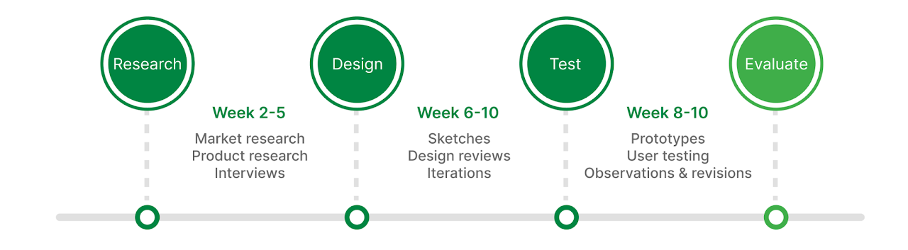
Phase 1 - Research
To achieve our objective, we conducted a comprehensive review of existing literature on onboarding tutorials and contextual help. We explored best practices by interviewing experts in various subject matters, while analyzing case studies from leading companies in our industry and beyond.
We then conducted user research to understand their pain points and challenges during the onboarding processes, as well as their preferences for receiving help and guidance. The user research was performed based on three distinct tiers of complexity. Custom ESS and Enrollment Hub (internal tools for clients) tools were utilized as sample products representing each tiers.
Phase 2 - Design & test
Based on our research, we developed a set of principles for three tiers of guidance. Then, we started designing components and guidelines for our sample products, ensuring that the iteration processes were recorded clearly.
Phase 3 - Testing & design revisions
Based on the designs, we have then conducted usability testing to evaluate the effectiveness of our new guidance system, and iteratively refined it based on user and designer feedback.
Phase 4 - Evaluate
The testing and the iterations should continue as the project gets implemented. Our project scope ended before this stage, but our documentation serves as a reference point for furthering the evaluation and refinement of the project.
Stakeholder interviews
→ click to return to table of contents
To better understand the project, we conducted interviews with our stakeholders concerning the project scope and expectations. As a result, following outlines were made.
Project scope
The project will have a global scope, which means that it will potentially be implemented to many different Paycom products. Therefore, the project goal isn’t to create an ISG for a specific product. Rather, it is to create a system of expectations and best practices for the usage of In-System Guidance in potential global implementations.
Users
The users of this project include both internal and external end users. The internal user can refer to the product designers, who would utilize our system to create an ISG for a specific product of their interest. The external or end users refer to the actual users of Paycom products who will be interacting with the ISGs created by the standards created by this project.
Success criterion
The project success will be defined by a decrease in IT support requests, since users wouldn’t have to contact their service representatives to understand our products. This would mean higher rate of user comprehension, or better reviews coming from the end users.
Tiered approach
We will have a three tiered approach to our products that will utilize ISG. Each tier will consist of different UI patterns and strategies involving learning theory. Following was the first rough definition of tiers that was outlined by the stakeholders:
- First tier: onboarding tutorials
- Second tier: on-page step throughs contained within page
- Third tier: large, complex walkthroughs that allow user exploration
Foundational research
→ click to return to table of contents
What is a product tour?
A product tour is an onboarding UX pattern used to guide users through the basics and necessary features of a product. Product tours are meant to be definite, clear, and simple.
Why use a product tour?
- Compel users to take specific, meaningful actions
- Guide users toward their aha moment
- Can be simple to build and experiment with
Common features of product tours
Diverse UI patterns
Flows, tooltips, checklists, resource centers, and more
Triggering options
Non-linear, interactive tours and real-time, event-based triggering
A/B Testing
Marketing experiment for most optimal product experience
Analytics
Completion rates of each steps as success metrics
UI patterns
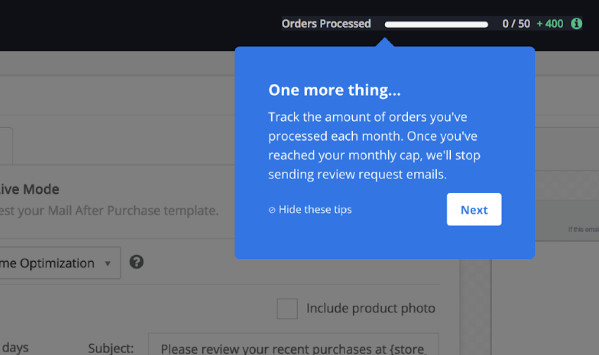
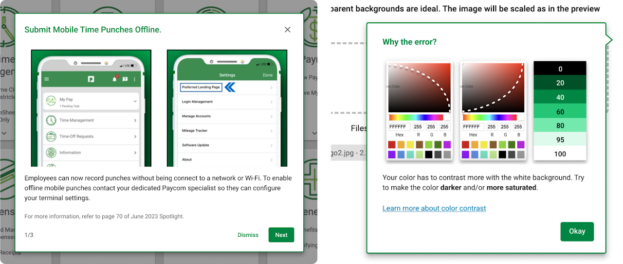
Modals
Modal windows, or overlays, are large UI elements that sit on top of an application’s main window. To return to the application’s main interface, users must interact with the modal layer. The modals are inherently and deliberatively disruptive.
Use cases:
- User onboarding, welcome message
- Feature announcements
- Additional user input
Best practices:
- Modal windows are disruptive, so it is better to stick to more subtle UI patterns for small announcements.
- Placement can be centered for immediate attention, but can also be based depending on the modal content, size, and the user’s workflow.
- When utilizing multi-modal flows, utilize progress indicators to motivate users.
- It should be easy for users to leave the modal window. Actively utilize x button or call to action to exit.
Use graphics, such as images, micro videos, or GIFs for attention grabbing.
Tool tips
Tool tips are brief, informative UI elements that appear when a user interacts with an element in a product. They are generally related to any active element on a page, meaning they are highly contextual and specific, and are not for the bigger picture or an entire task flow.
Use cases:
- Feature announcements
- Providing additional information in-context
- Fall-safe for users when they can’t understand a feature
Best practices:
- Do not use for vital or redundant information.
- Keep the information brief as a micro content.
- Ensure to have moderate contrast against the background.
- Position so they don’t block related content.
Allow confirm or exit.
Walkthroughs
Interactive Walkthroughs are on-screen tutorials that show users how to use a product through in-app guidance. It provides the contextual guidance, in the flow of work, to drive adoption. It involves the users as an active part of the process, and lets them interact with and discover the product. Product walkthrough may involve multiple patterns, including modals, tooltips, and other elements.
Use cases:
- Introducing many changes are made at once in a product
- Onboarding, redesigning, or doing a complex feature release
- Best practices:
- Highlight any next steps, or present a clear call to action.
- Build experience flows for the product’s walkthrough
- Allow the walkthroughs to be optional. It should be easy for users to leave the flow, using an exit or dismiss button.
Incorporate usability by considering keyboard hovers.
Subject matter expert (SME) interviews
Based on the outline of the project laid out by the stakeholder interviews and the market expectations of product tours, we reached out to experts of subjects that closely relate to this project. We specifically deep dove into accessibility and learning theory for this project.
Accessibility (a11y)
Accessible design is a design process in which the needs of people with disabilities are specifically considered. It allows users of all abilities to understand, use and enjoy the product we create. One of the core values of Paycom is "We Care." We create solutions to make life better for all. In order to attend to this value, Paycom products conform to WCAGS 2.1 (Level AA) accessibility standards, with four major standards: perceivable, operable, understandable, and robust.
Types of disabilities & accommodations
Physical disabilities: amputation, muscular dystrophy, or other physical limitations may require accommodations that allow products to be used with mouse or with keyboard only.
Visual disabilities: those with vision impairment will need to use screen readers or similar programs that distinguish between inputs. (buttons, selections, drop downs, etc.) Descriptions like alt text are needed for images and interactions.
Auditory disabilities: captions should be available for materials involving audio. Closed captioning is preferred over live captioning.
Cognitive disabilities: language used in the products should be generally easy, around 5th grade reading level. Only the necessary terminologies should be utilized with controlled assumption.
Color blindness: information should not be presented by color alone.
Best practices - accessibility
Along with the specific adaptations for disabilities presented in the previous section, some features must be implemented with close communication between the design team and the development team. For instance, in order to properly name all input fields, clear presentation should be made on what each fields are expected to do and how they should be presented textually. Additionally, both parties must take into account the tab order and the hierarchy of on-screen elements, such as popups, so that the screen-readers can pick up on the items in a chronological manner.
Learning theory
Since Paycom products are targeted toward client companies and therefore adult users, the ISG must utilize the concept of learning theory for adults in order to effectively communicate hard-to-grasp concepts and flows within Paycom products.
Key principles of andragogy
Adult Learning Theory, or andragogy, is the concept or study of how adults learn and how it differs from children. It aims to show how adult learning is distinct and identify the learning styles which suit them best. The following are the central principles of andragogy based on assumptions:
- Adults want or need to be involved in how their training is planned, delivered, and executed. This is because they are motivated intrinsically when it comes to learning processes.
- Adults gain more when they can pull from past experiences.
- Rather than memorizing facts and information, adults gravitate towards solving problems and using reasoning to best take in the information that they are being presented with.
- Adults want to know how they can implement the information in their lives. They look for practicality.
Best practices - learning theory
The usage of language is also important in creating an engaging and motivating learning environment. The following are some best practices concerning language and process presented by the SMEs:
- Limit jargon, acronyms, and technical words.
Keep the language aligned to the product line itself, so that the users speak the same language as us; however, keep that only for the most necessary terms. Otherwise, stick to AP style language.
- Motivate the users by showing progress.
This creates a gamification process that increases learning motivation as well as knowledge retention and learner engagement. Utilize reward system when user does something right. Reinforce learning with positive language without imposing or shaming when they do something wrong.
- Make careful assumptions.
Adult users do not like to be insulted. Respect the users by avoiding oversimplification. Create an experience that helps the user self direct. Utilize assessments to revise assumptions.
ADDIE process
The Addie model is an instructional design methodology used to help organize and streamline the production of a training content. This process can be used to find the best way to implement the concepts presented in the previous section into our project.
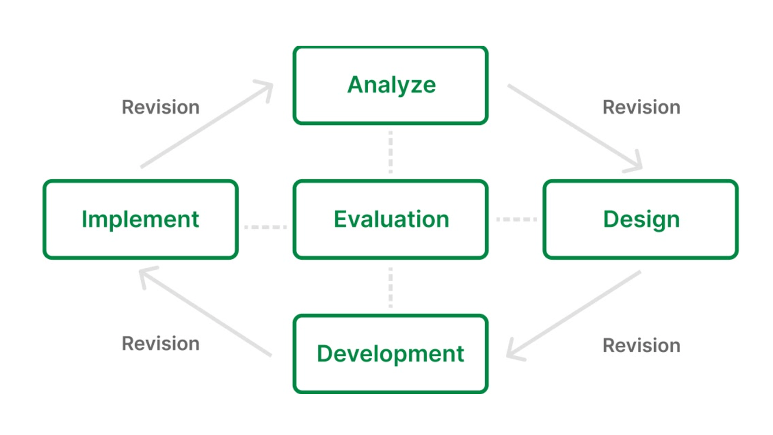
Analysis: study the current situation in terms of training, knowledge gaps. Define the goal of the training. Generate a training plan that addresses who, what, when, where, why, and how.
Design: make practical decisions including strategy, delivery methods, structure, duration, assessment, and feedback. Then, create visually driven storyboards to map ideas and to create a prototype.
Development: create the course based on the storyboard / prototype. Pay attention to the details including graphics, grammar, syntax, etc. A key consideration at this stage is navigation.
Implementation: keep track of the delivery and feedback.
Evaluation: improve and revise the content based on feedback and other training requirements.
Words from client-facing teams
Our final interviews surrounding learning theory involved employees in the customer service departments who have direct contact with our users.We also interviewed a product analyst concerning current user pain points in Paycom product usage. Following were some points tackled during these interviews:
1. User pain points in product interactions
Users generally have problems with understanding how something might function, not knowing the correct name of a feature or a product, or not having good memory retention of learning materials.
2. User pain points in learning processes
During product learning, users tend to think that the process is not necessary. When they do come around to feel the necessity, they are already frustrated with another problem, which is often times urgency. Lastly, the users tend to dismiss new information presented through popups.
3. Methods to approach user pain points
We should approach the problem by identifying root cause. First, we should find the end goal. Then, we should work backwards from the goal. The 5 Why’s (asking why 5 times in a row) can be utilized during this process.
3. Language
They also stressed the importance of using language that shows we are invested in the user’s learning process. We should avoid the user feeling like it is a "them problem." Make it our problem by using words such as “we” and “our”. Lastly, constantly empathize to create a good relationship and reliability.
4. Failure scenarios
When user fails to have a thorough learning experience, we are to follow up with them with information or with other means of information learning (instructional videos, articles, links, etc.) All users have different levels of knowledge and memory. Repetition in learning is an expected behavior.
Additional research on UX writing
Linked below are some additional UX writing resources that were considered in our research phase. These topics were explored:
- What makes tool tips effective?
- What are some successful examples of guidance languages?
- What are some best practices in the UX writing market?
Words Matter by Wix: Tooltips: How to Craft Effective Guiding Text
UserGuiding Blog: 12 (Unbelievably) Good Tooltip Examples and Best Practices
The Gig Gal: UX writing tooltips: The ultimate writing guide
Assumption mapping
→ click to return to table of contents
With the information collected through the market research and the SME interviews, we first created an assumption map to lay out the foundations for our upcoming user interviews.
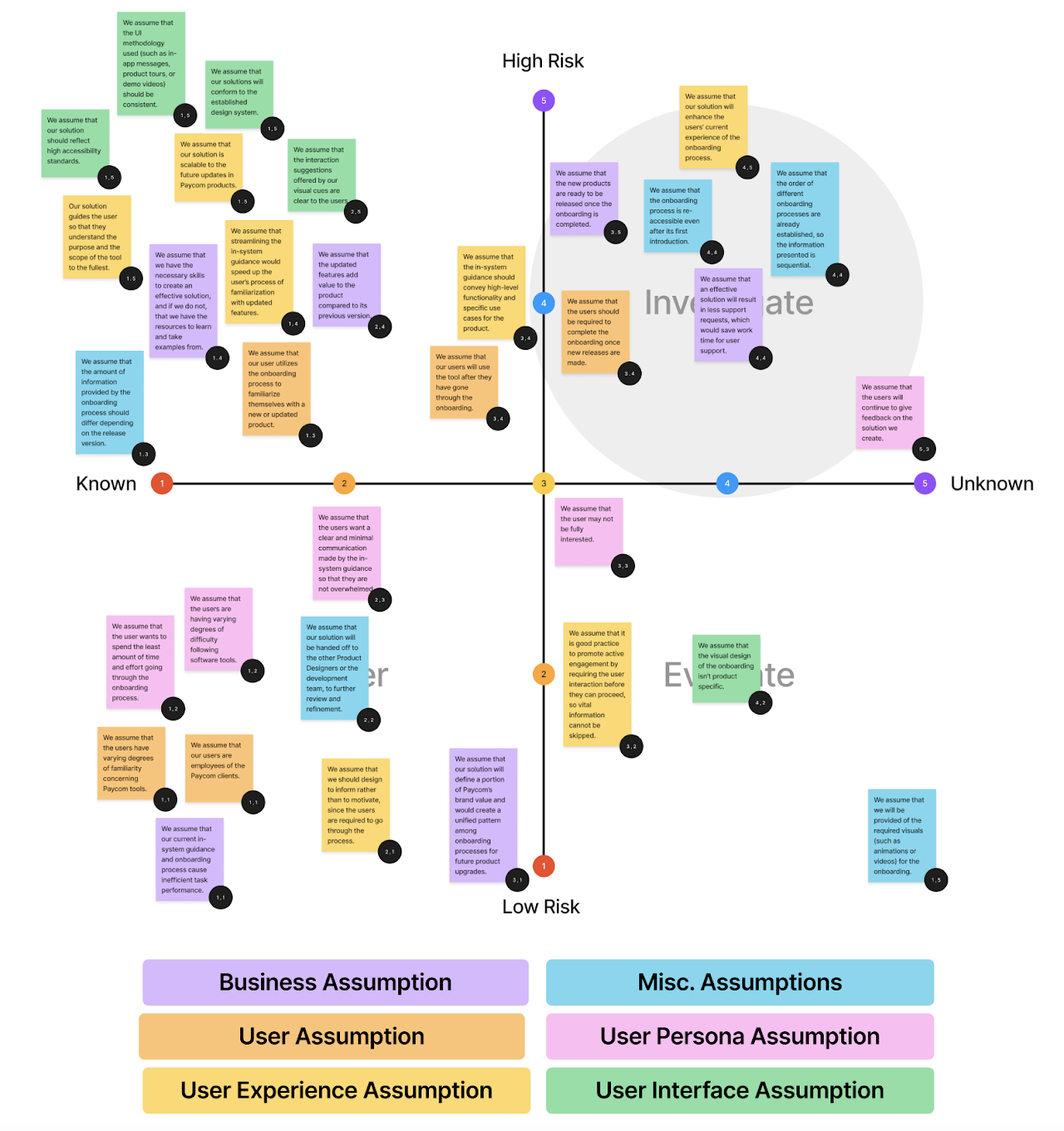
The assumption mapping divides into four prioritization quadrants: defer, evaluate, plan, and investigate. We focused mainly on the Plan and Investigate quadrants to address in our user interviews, since these are assumptions that need to be addressed before any further progress can be made.
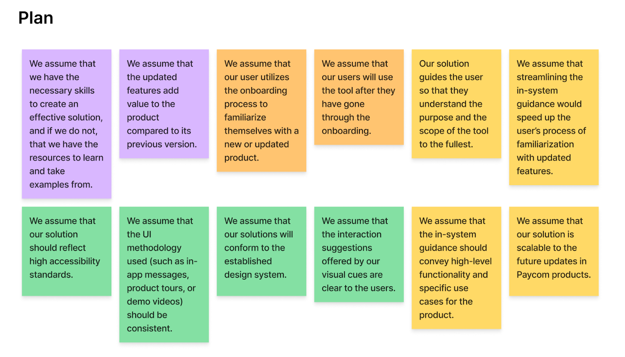
Above are assumptions that are made with higher confidence, but will cause high risk if proven to be wrong. We created a number of assumption on user experience and user interface based on our market research on best product guide practices.
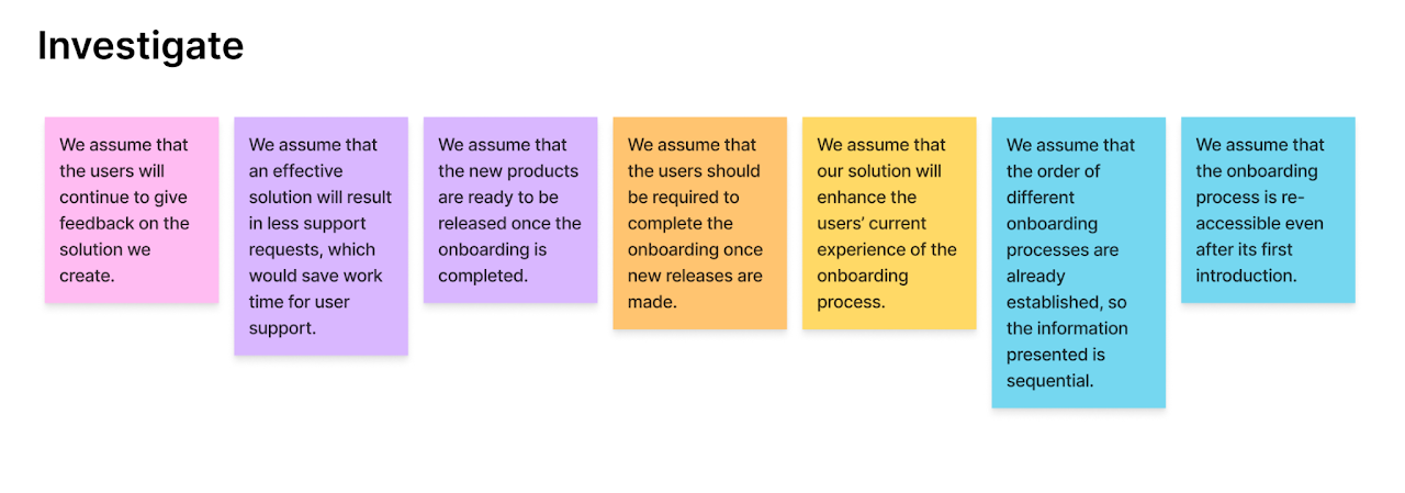
Above are assumptions that are made with low confidence and high risk. Assumptions in this quadrant are the most important to be explored during the research phase, so we planned our user research and potential testing around verifying the validity of these assumptions.
User research
→ click to return to table of contents
Since this is a project that is globally applicable across all products and systems, it is difficult to discern a specific user set for the project itself. Therefore, we decided on two specific Paycom products to define our user base and to test the ISG on. The two products were chosen based on our earliest definition of Tiers 2 and 3. As a reminder, these were the definitions we set:
First tier: onboarding tutorials
Second tier: on-page step throughs contained within page
Third tier: large, complex walkthroughs that allow user exploration
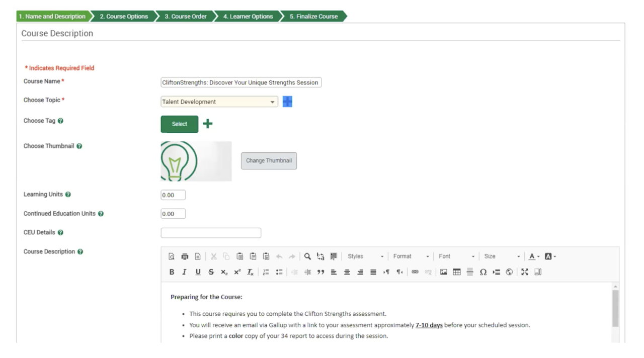
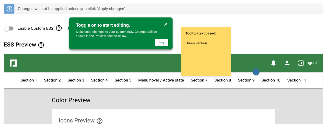
Tier 2: CustomESS
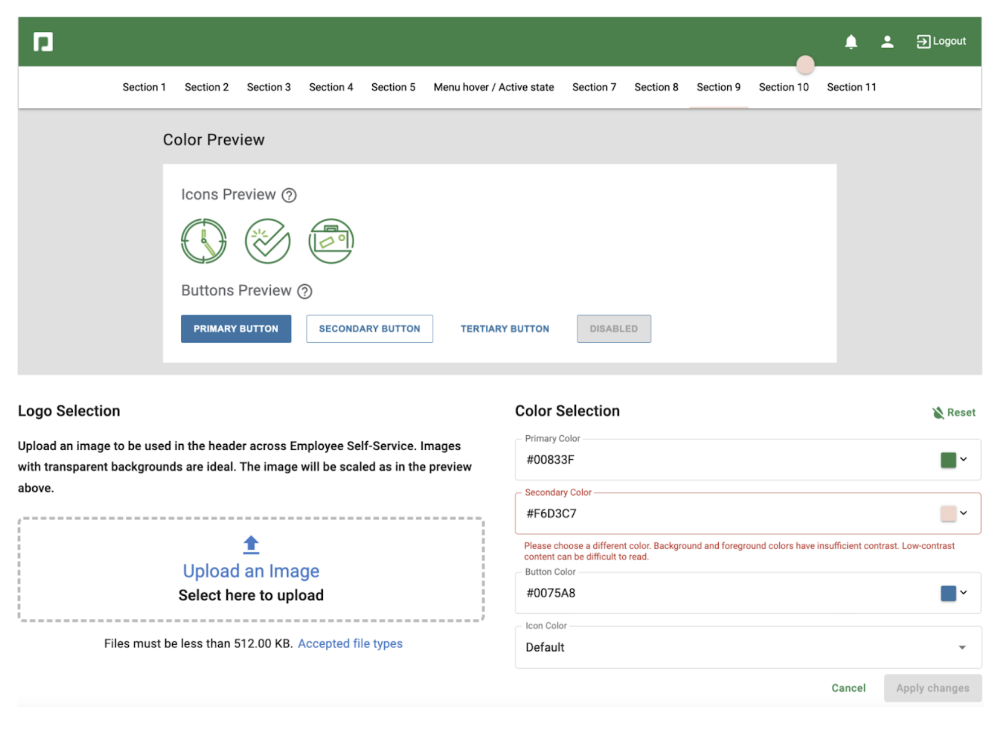
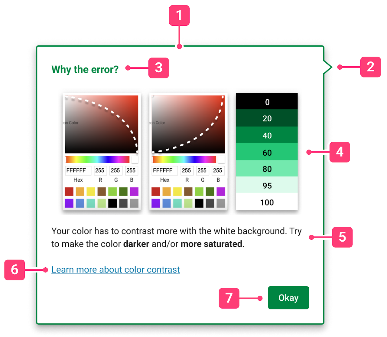
Custom ESS is a tool allows Paycom clients to rebrand the way their employees see their payroll portal by using personalized colors and logos. Current issues with the product shows to be users’ frustration on contrast errors.
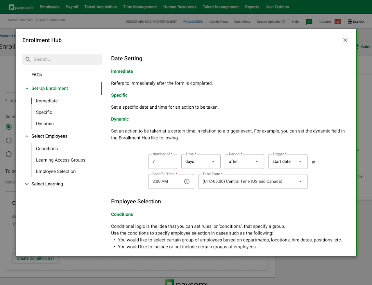
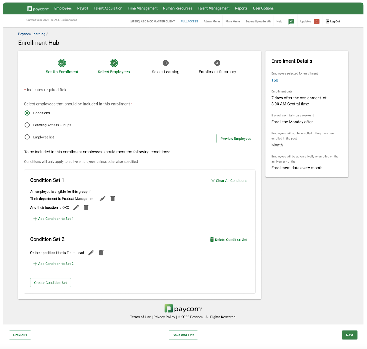
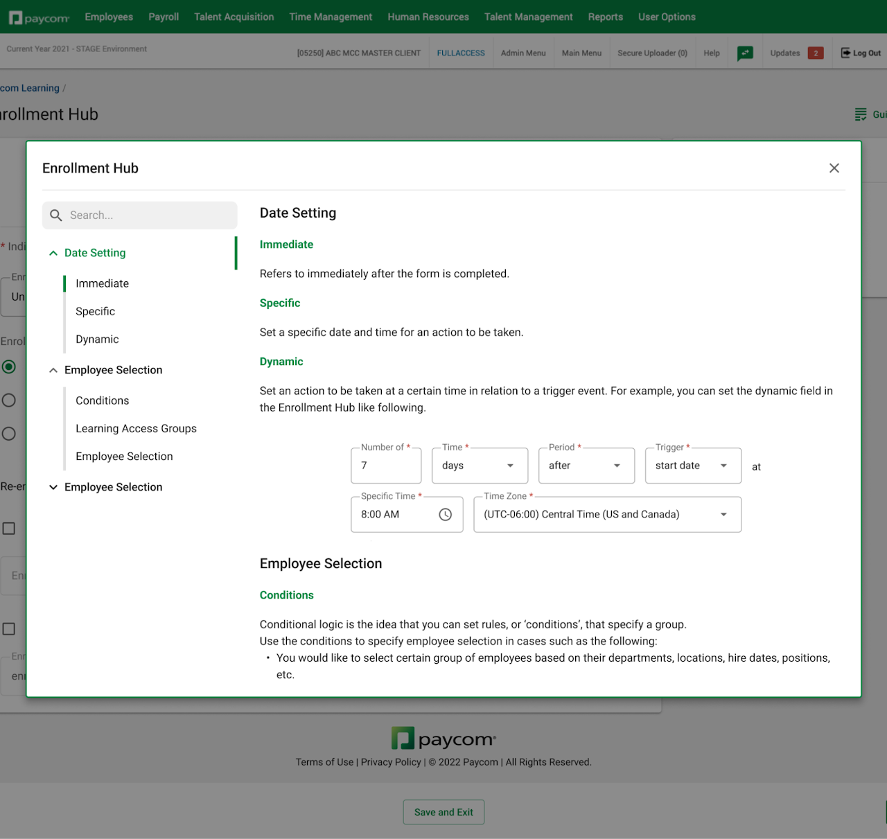
Tier 3: Enrollment hub
Enrollment Hub was a project in active development at the time of this project. As of now, it has been released and deployed. being developed for Paycom customers to use. It rebranded the course assignment workflow that was previously available in Paycom Learning, which sought to let customer service specialists set up learning courses for customers to get a better handle on product features. Based on the usability test that was conducted by the design team on the Enrollment Hub project, user pain points resided in the learning process of Conditional Learning.
CustomESS/Tier 2 product research
Not much information could be gathered about Custom ESS, since it has been in the Paycom system for some time, and those who worked on the tool as designers or a project managers weren't working at Paycom anymore. Therefore, we conducted a series of usability tests of the pre-existing product as part of the research. Our objective was to distinguish the main user pain points which ISG could help with.
The task
Pretend you're a Paycom customer and:
- Redesign the ESS into Barbie theme.
- Reset your design into original Paycom design.
The observations
We conducted 6 tests, and following were the observations made.
- 80% of the users mistakenly tried to find first interaction in the "Preview" field.
- 80% of the users didn’t understand the reason for contrast errors.
- 60% of the users didn’t know what color to choose to get rid of the error.
- 60% of the users misinterpreted what "background" and "foreground" colors meant in the error text.
Product-analyst-provided user feedback
Additionally, we reached out to the Product Analyst department to retrieve the most recent pieces of user feedback related to this product. A lot of the feedback related to parts of the product that could be tackled by the ISG’s support, however, some relevant feedback aligned with the following quote:
“I have experienced a number of Custom ESS setups where two colors that, in my opinion, have sufficient contrast between them and would be very visible to employees and users of ESS will still get flagged by the system as not having sufficient contrast.”
Enrollment Hub/Tier 3 product research
Unlike the Custom ESS tool, we were able to get in contact with various people involved in the creation of the Enrollment Hub, since it was a product in active development at the time. We conducted multiple user and designer interviews concerning the previous version of course assignment, the changes being made, and the new design of the "Enrollment Hub" project.
Our focus was distinguishing the similarities and differences between the current version of "Set Up Courses" and the "Enrollment Hub," since the new features will determine potential learning/adapting challenges for the users. The words and concept of "Conditional logic" are being introduced, so let's quickly go over what that means in this context.
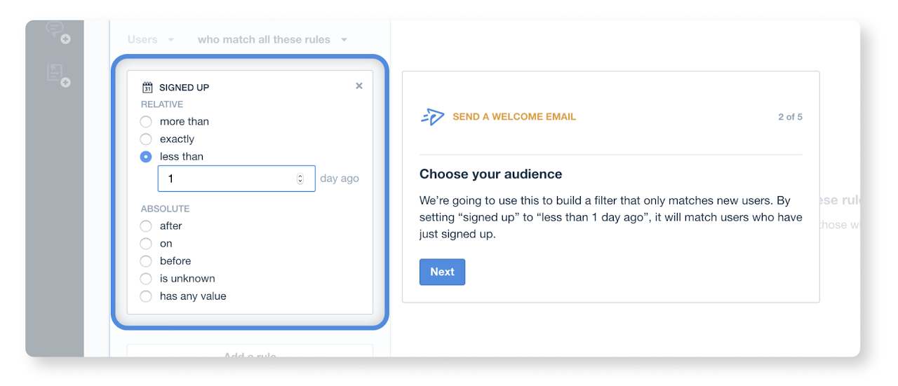
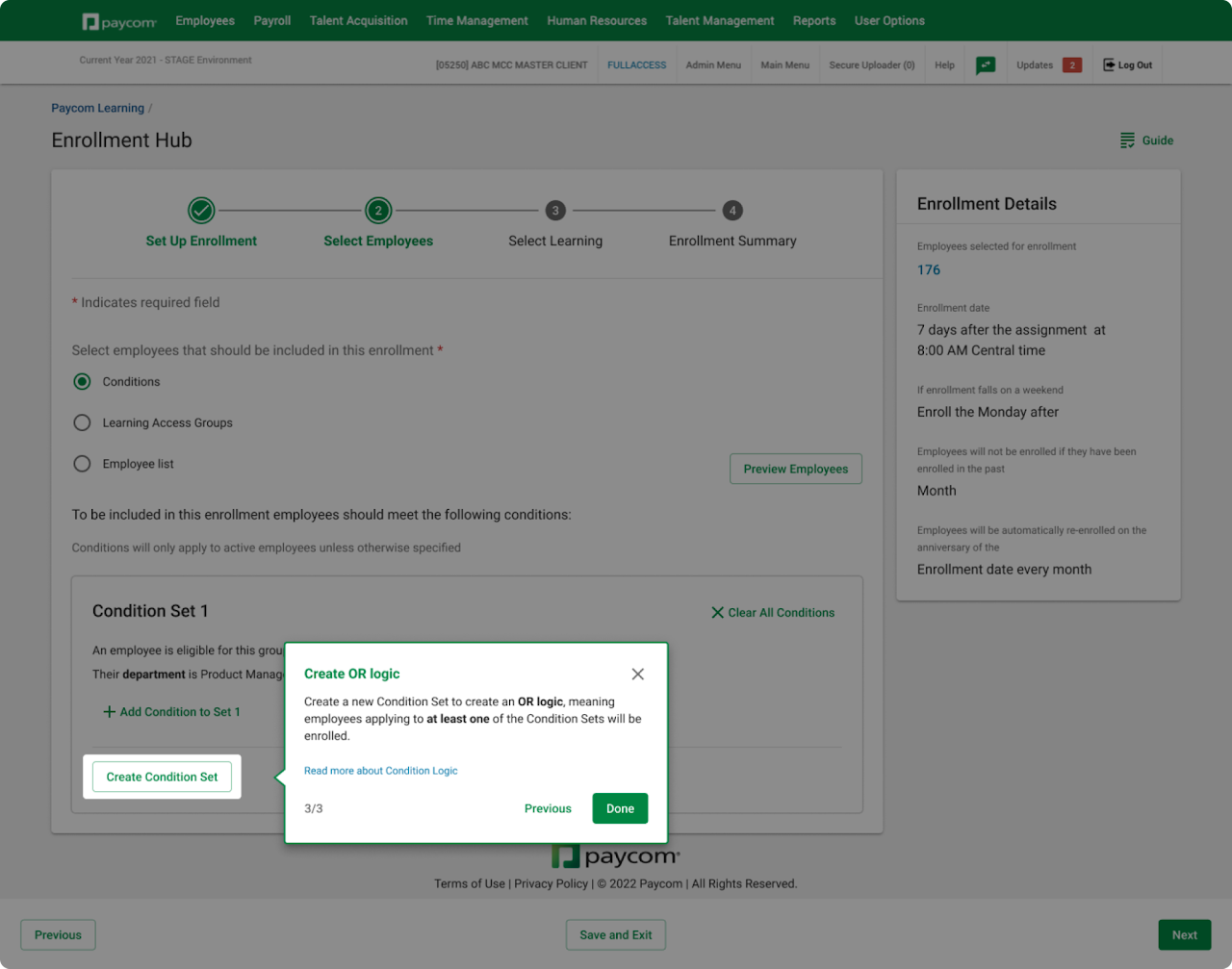
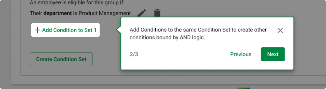
Conditional logic
Conditional Logic is the idea that you can set rules, or ‘conditions’, that cause your process to change based on input.
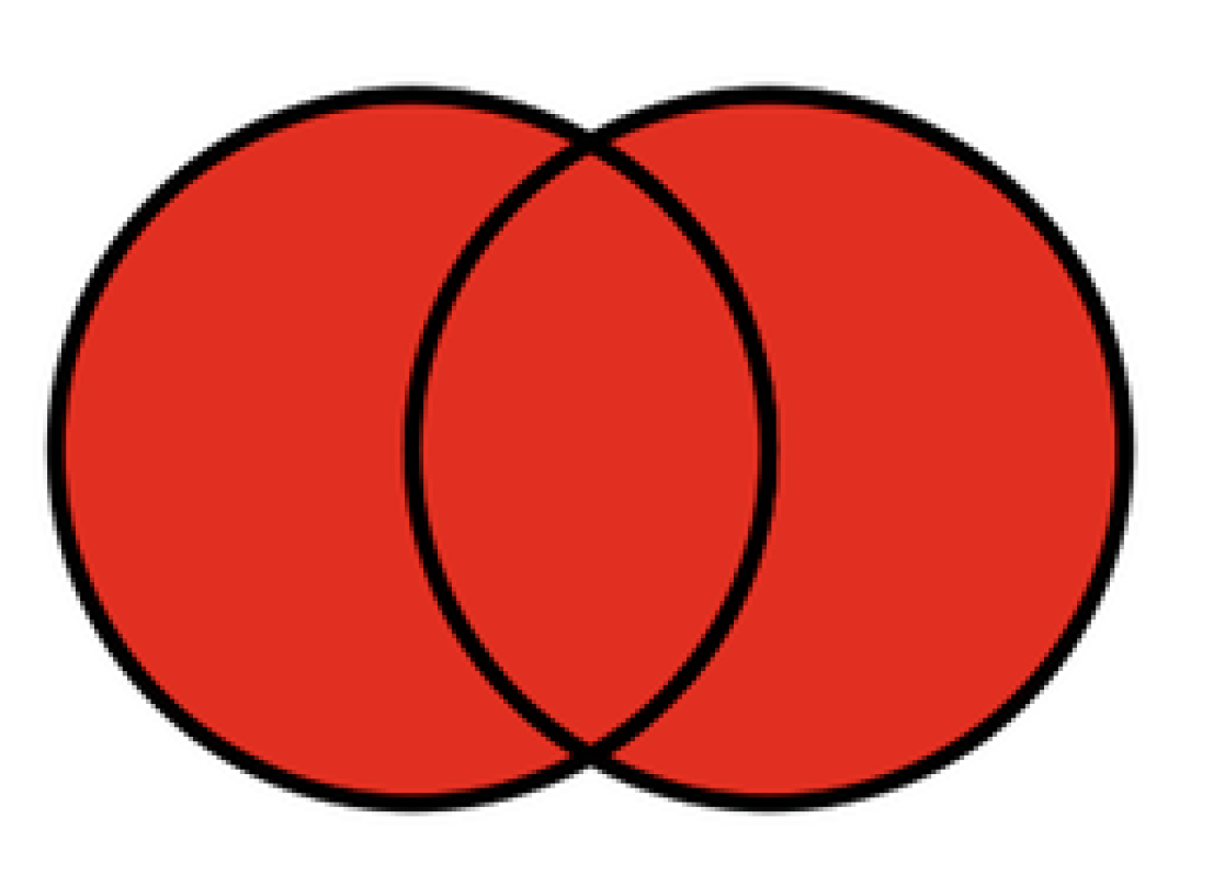
An example of AND Logic:
Employees will be enrolled if they meet all conditions bound by AND. Create AND logic by adding conditions to the same set.
For example, utilize the AND logic for specifying employees like the following:
- Employees who are Product Managers AND are located in OKC.
- Employees who are Team Leads AND are not employees for less than a year.
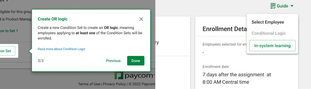
An example of OR Logic:
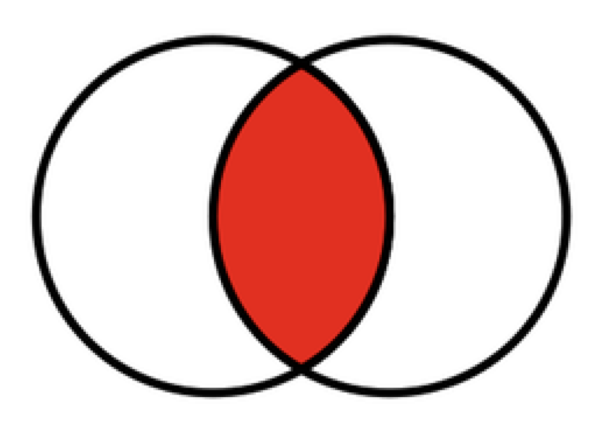
As long as at least one of the conditions is met, the employees will be enrolled. Create OR logic by creating new Condition Sets.
For example, utilize the OR logic for specifying employees like the following:
- Employees who are Product Managers OR Product Designers.
- Employees who are Product Managers OR whose name is A, B, C, D
Now that we understand conditional logic in this context, let's look at the biggest similarities and differences between the old "Set Up Courses" and the new "Enrollment Hub."
Similarities:
- Conditional logic elements of “AND” and “OR” were used before.
- “Specific” and “dynamic” date setting wording were used before.
Differences:
- The words “conditional logic” are being introduced.
- The concept of “Learning Access Groups” is newly being introduced.
- The concept of “Expiration date” is newly being introduced.
Enrollment Hub interviews
The project manager of the Enrollment Hub project expressed that they hope the ISG will highlight the new features in such a way that gets people to optimize their processes of learning assignment, and to trust that we have the options for them. In order to do so, we reviewed the usability tests previously conducted by the Enrollment Hub team with their latest design. The following were the top themes of the observations made:
- Users gravitated to the legacy list and filters when initially entering the page. This was due to visibility but also confusion around what the new Conditional Logic options were.
- Most users were able to get through Conditions with some help, but it often included searching and experimenting with the different selections. This spoke to a need for clearer language and guidance.
Along with the usability test observations and the series of designer interviews, we concluded that the following are the major pain points that we should tackle with ISG and build a tier 3 framework around:
- Complex pieces such as conditional logic
- What the new features are and how to access them
- Distinguishing between specific and dynamic selections
- Distinguishing between due dates and expiration dates
Journey mapping
→ click to return to table of contents
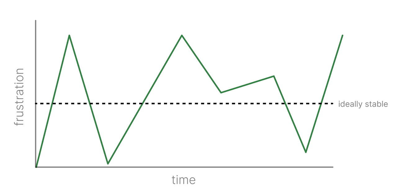
Based on the usability tests conducted by the core Enrollment Hub team, we created the user journey map to better understand the user’s emotions, pains and gains throughout their usage of the product.
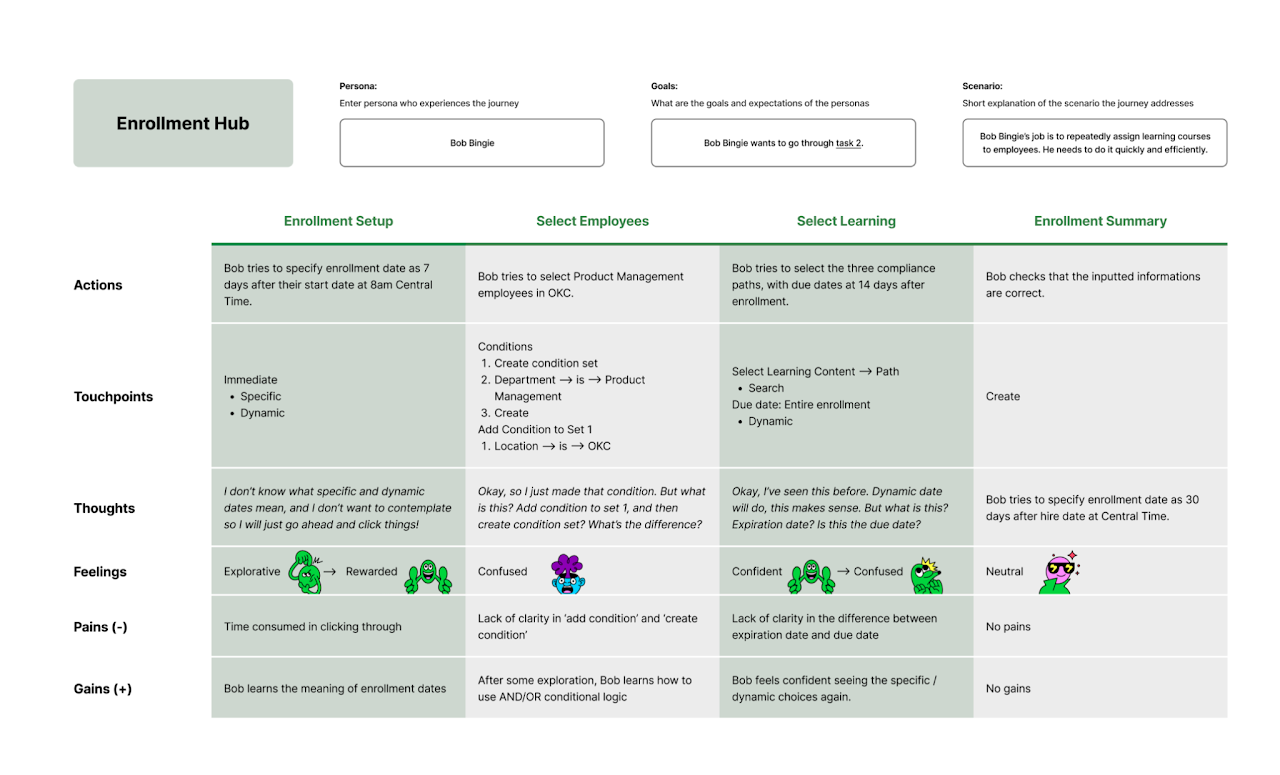
Our goal with the ISG was to create a more neutral flow of user emotions rather than one with severe spikes in highs and lows. They will be better informed about the product, and even if they are not informed due to dismissal, they would still be aware of the presence of assistance.
Affinity mapping
→ click to return to table of contents
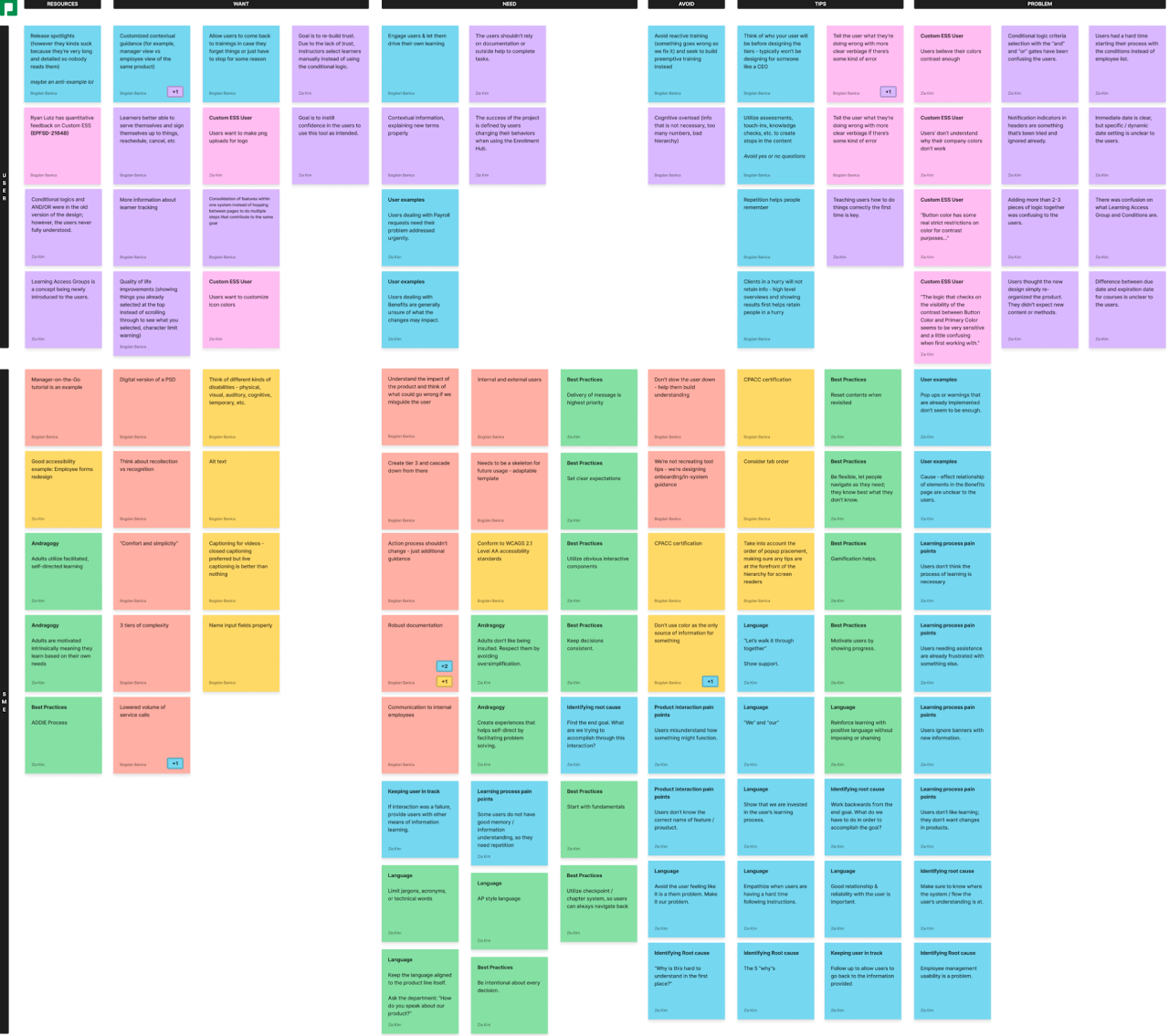
Based on the entirety of research conducted, we created an affinity map as a brainstorming tool to group our needs as preparation for the solution finding phase.
Sketching
→ click to return to table of contents
In order to get started with sketching, we had to loosely define the tiers of complexity from the expectations presented by our stakeholders. We brainstormed ideas on what function each tier should serve, and then sketched out potentials for what they could look like as UI elements.
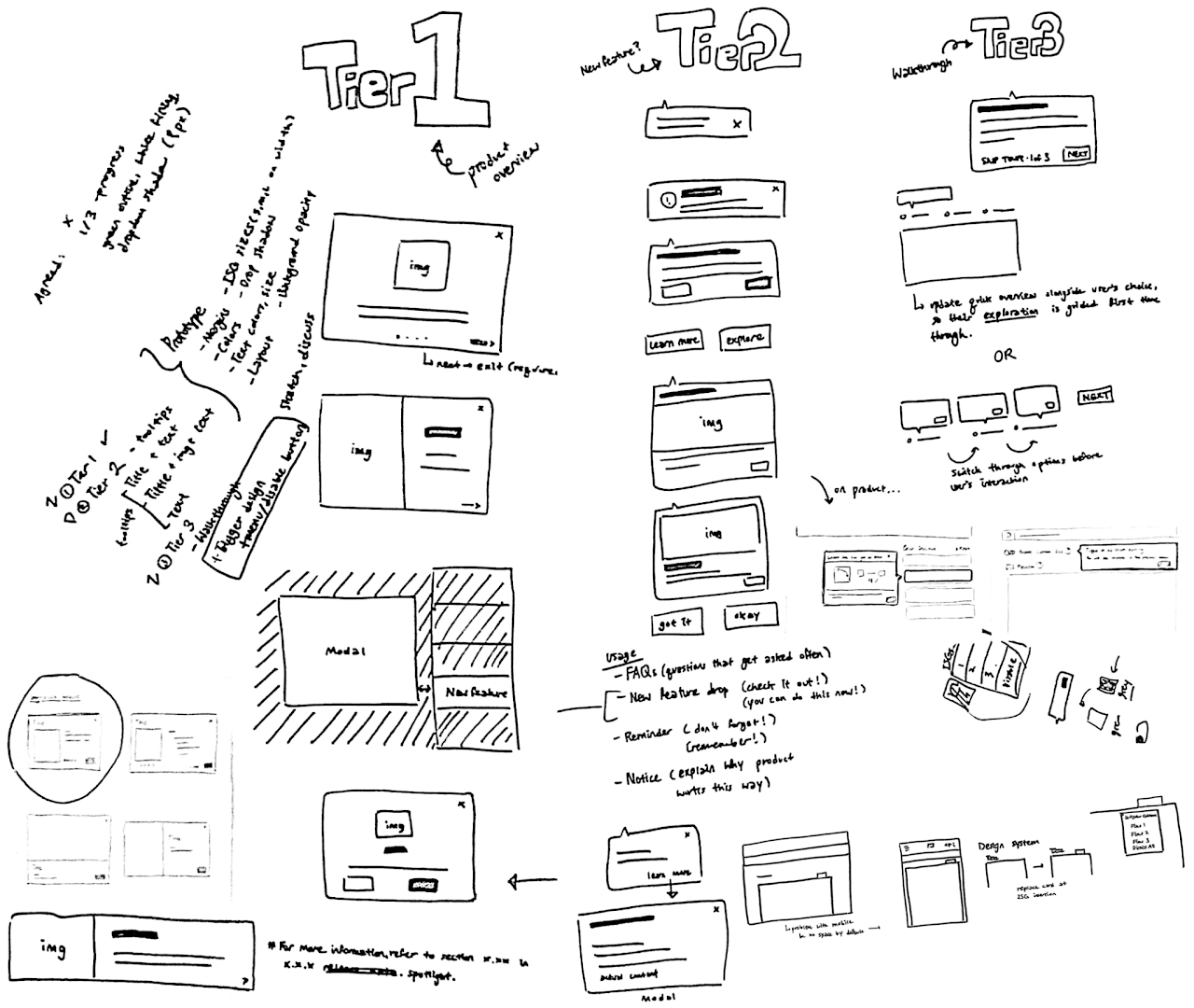
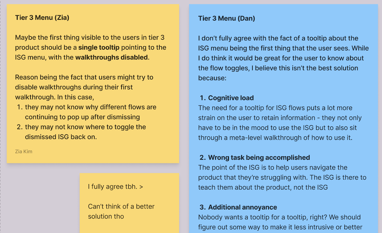
Following the preliminary sketches and some brief discussions, we focused on some more flow-specific scenarios and how things would be toggled on/off, dismissed or revisited. This is a tool that's supposed to be helpful after all, and not just something intrusive that you can't seem to get to go away.
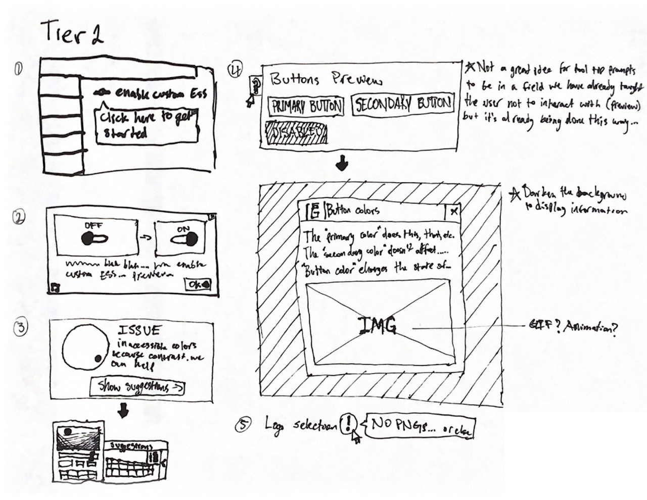
Design iteration #1
→ click to return to table of contents
Tier definition
After the rough brainstorming, we defined the three tiers of guidance as the following:
Tier 1
A single modal strictly for product updates or overviews - can have a resource at the bottom somewhere directing the user to where they can get additional information if they want it.
Tier 2
A set of concise tool tips that users can access at any point in no particular order. They can contain at minimum a blurb of text, and at most a title, image, and text. Various combinations can be used depending on use cases.
Tier 3
A guided walkthrough that makes use of all the other components to create an elevated experience. The user has the option to disable or enable the experience at any point depending on their needs.
Once we narrowed down the scope and direction of our work, we started drafting up some component designs and laying them over the top of existing products to see how they would look.
Component designs
At this stage, we created several different iterations of ISG components:
The designs started out with the basis on the pre-existing design library, such as Paycom's basic modal. However, with some creative freedom, these were some choices we made that deviated from existing design system components:
- Green outline along with the elevation, in order to make the ISG more distinctive from the background
- Green title for attention grabbing
- Fatter/wider margins
With the components designed, we moved on to mockups specific to the three sample products correlating with the three tiers.
Tier 1 & 2 mockups:
Triggers
The availability of a trigger was a constant point of discussion for the re-accessibility of the ISG components. For instance, if the user dismissed the ISG but later feels the need to go back to it, they need the means to turn the ISG back on.
Following were some points of discussions concerning the trigger:
- Where should it be located?
- What kind of UI element should it be presented in?
- How can we make it easily accessible to the users?
- Would users see the ISG every time they interact with the product?
These are some of the initial trigger drafts:
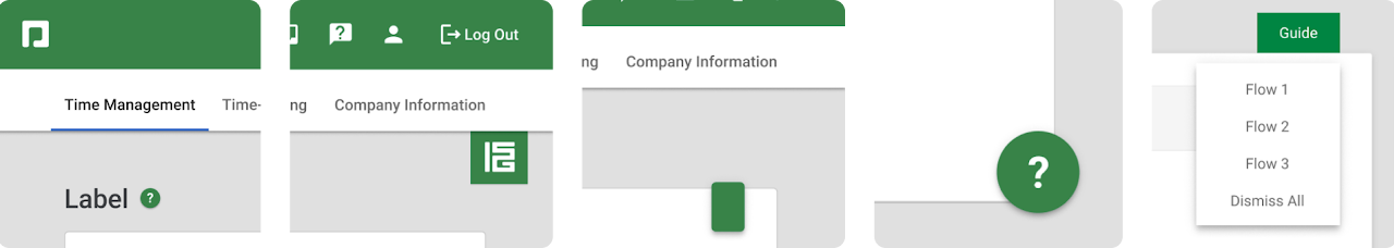
The ISG can be toggled on and off using the trigger. We got some feedback on our trigger design and discovered that we could do a better job at complying with the design system and having a more responsive and usable design.
Based on a series of feedback from design professionals, we settled on a new version of the trigger. It is a regular button component placed at the right side of the breadcrumb section of a page, to activate/deactivate the tool tips entirely with one click, minimizing the amount of clicks needed to complete the toggling action.
Prototyping and usability testing
→ click to return to table of contents
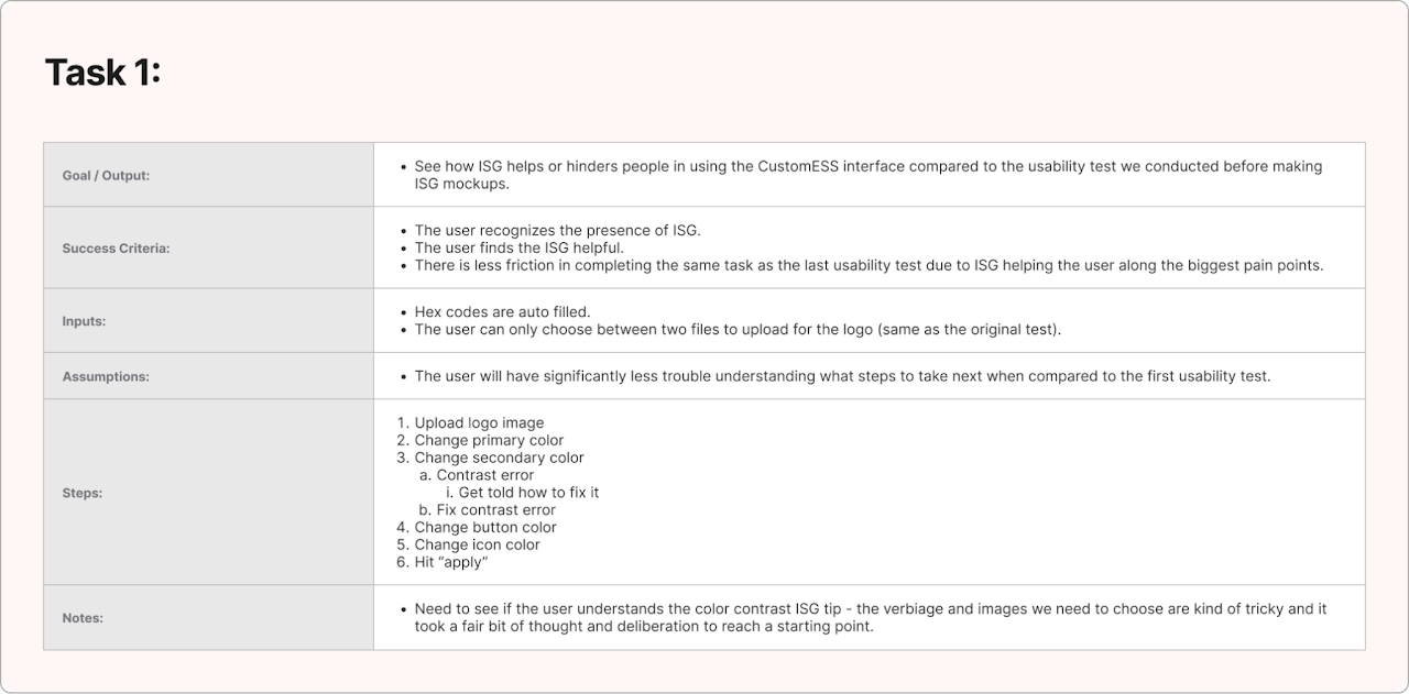
Task creation
In order to effectively complete our usability tests, we came up with tasks, success criteria, user flows, and more. The first product we tested with was Enrollment Hub. The overall goals were to:
- Get the user comfortable with usability testing
- Observe the effectiveness of the ISG
- Observe whether or not the user could re-trigger the ISG without being told where/how to
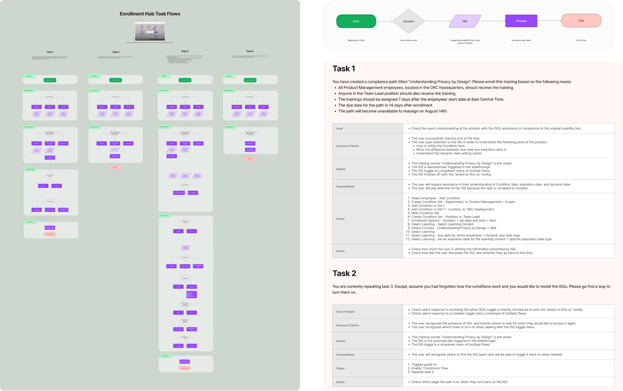
Prototyping
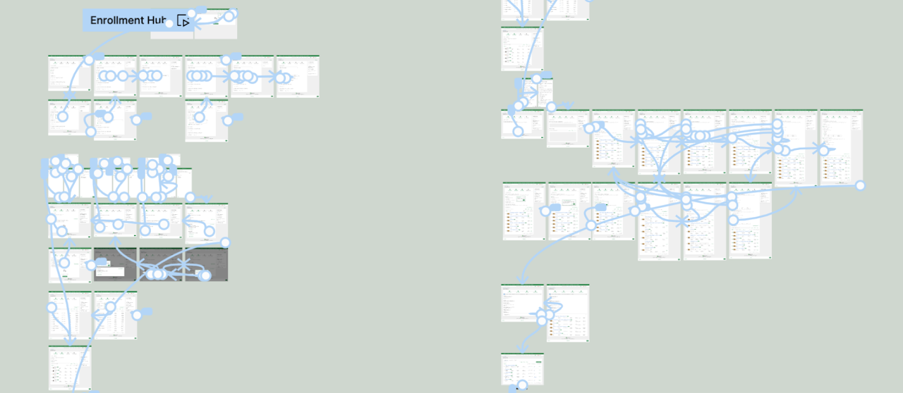
With our tasks prepared, prototyping began. The appropriate flows were created, and the ISG logic was applied using Figma’s conditionals, variables, and overlays.
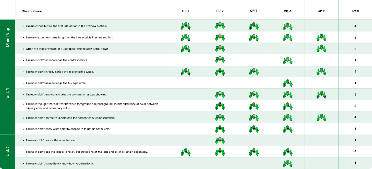
Testing
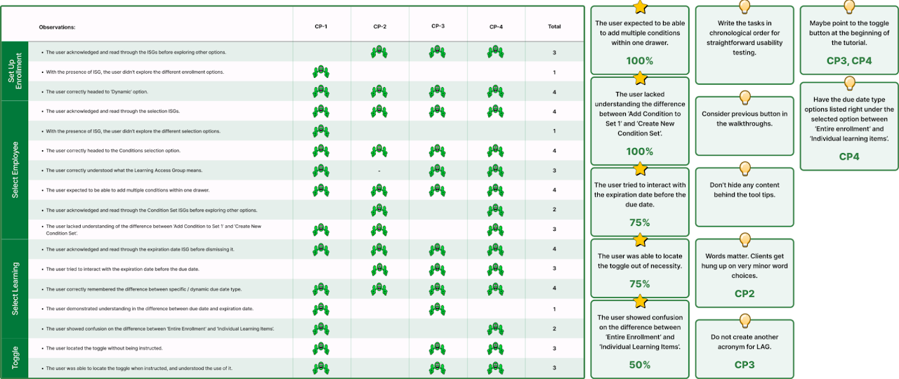
We tested with 4 people and got design feedback from 6 others. We took thorough notes during all of the testings, then we put our high level observations into a chart format. We also added a section that tells us the most relevant/pressing information that applies to the most amount of people so we could have things to focus on improving going forward. No real names are used for the sake of privacy compliance, and "CP" stands for "Client Participant."
Running into trouble
When it came to usability testing our other tier 2 product, CustomESS, we ran into some trouble. We prepared the same materials for it as we did for Enrollment Hub:
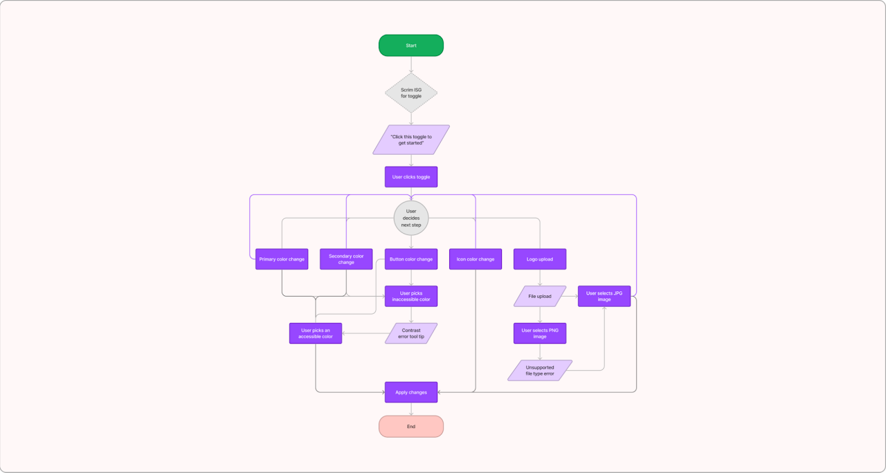
However, the scope was very limited and didn’t leave us with a lot of useful information, so we stopped after the first test and instead chose to focus on implementing improvements that Enrollment Hub helped uncover a need for.
Design iteration #2
→ click to return to table of contents
Suggestions and revisions
Our aim with creating prototypes was to contextualize the information we gathered from the usability testing in order to help devise patterns for learning, then conduct further tests to see if they work in practice.
One of the points that came up was how/when to draw the attention of the user to a specific element on the screen. Initially, we just had tool tips pointing to elements, spaced 20px away from the edge of said element. After doing our usability testing, we found that there was a need for a scrim (darkened background) outline for some elements to make it evident what the user should interact with.
Re-defining tiers
We realized that in order for our designs to be more effective, we would have to slightly shift our tier definitions. Going forward, the tiers shifted to:
Tier 1: Would now allow for multi-page modals, and providing additional resources at the bottom is encouraged.
Tier 2: On-page step-throughs contained within page. (No change.)
Tier 3: The walkthrough should make use of scrims and visual aids, and always give an indication of progress and an ability to go back and forth between the steps of the flow.
The full length descriptions of the tiers with contextual examples are covered in greater detail in the “design solutions” chapter.
Additional scope
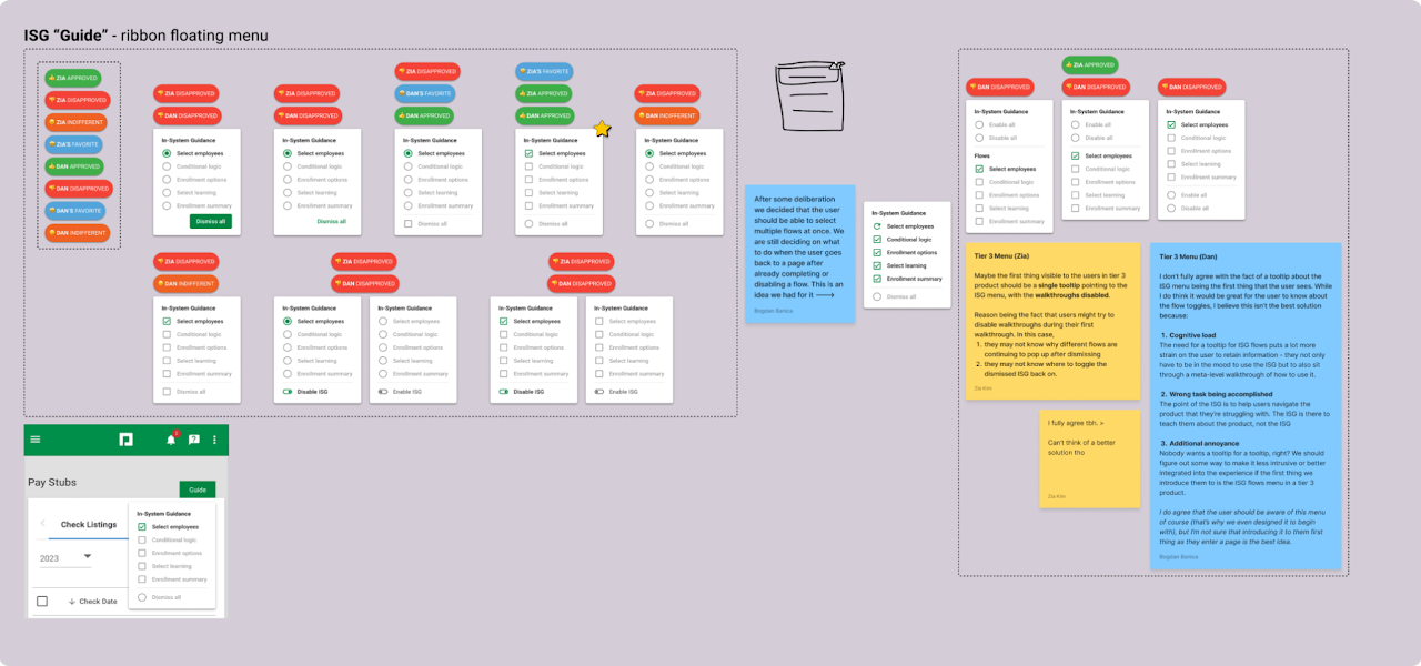
Once our tiers were set in stone once and for all, we focused back on the “Guide” toggle. We considered products with a larger scope than something like CustomESS or Enrollment Hub, and saw examples of products that have multiple user flows per page. The user would greatly benefit from a solution which allows them to step through the different flows within a page and go back to whichever one they like at any point. Though we had thought of this before, we didn’t have time to implement a satisfactory design before it was time for usability testing.
We made these designs and ran them by some other designers for feedback:
We created dozens of iterations during meetings with other designers, and had back and forth discussion regarding different aspects of it.
Following this, we fell back onto CustomESS. Through a brainstorming session with our TL, we came up with the idea to provide a more thorough service with ISG, something we would go on to call ISL (In-system learning).
The goal of ISL is to provide additional context and learning opportunities for the power-user looking for something more. Ideally, the user could toggle this container of information and learn things such as vocabulary words used in Paycom products, see contextual examples of expected behaviors, and generally get more clarity about the module they’re browsing from an internal source. We began iterations for how this might look:
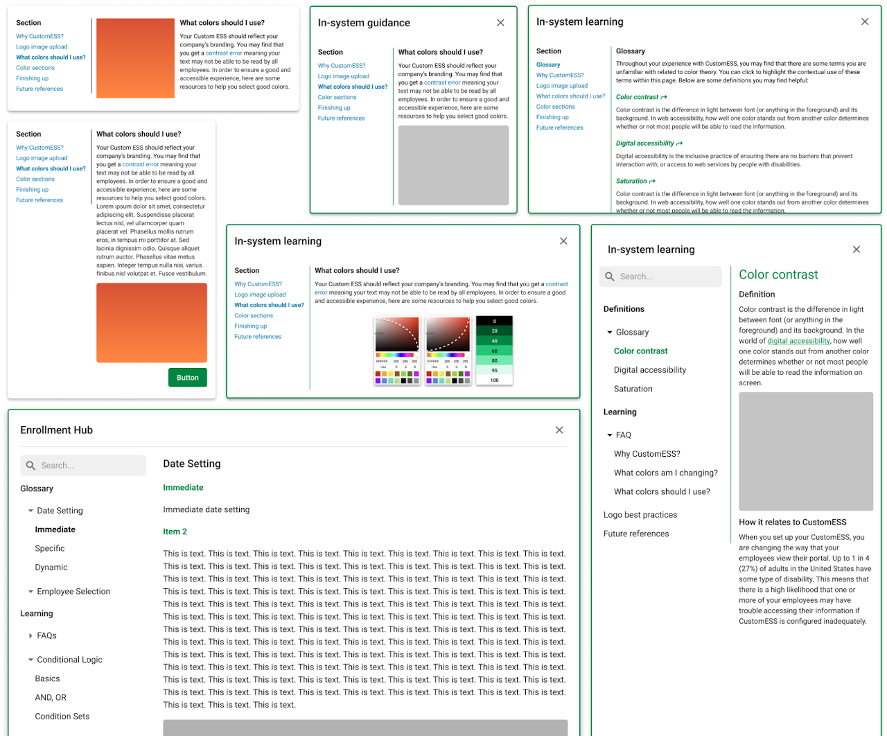
The feedback we received along the way raised some good points. We ultimately went with a large modal design that would encompass a glossary and learning components, akin to Wikipedia. In our final version of this design, we added a search bar, matched the margins and padding to the rest of our designs, added a search bar, changed the navigation to use the existing nav tree component, and documented how information and visual aids should be displayed.
ISL Trigger
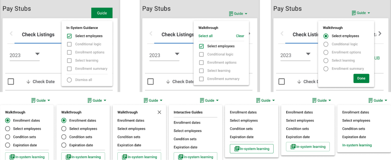
With the new addition of the In-system Learning component, we had to implement a way to trigger it.
We decided to make some modifications to our toggle component that would allow users to find the information regardless of what they’re doing on the page, but also allow them to access it from within a tooltip.
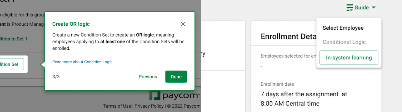
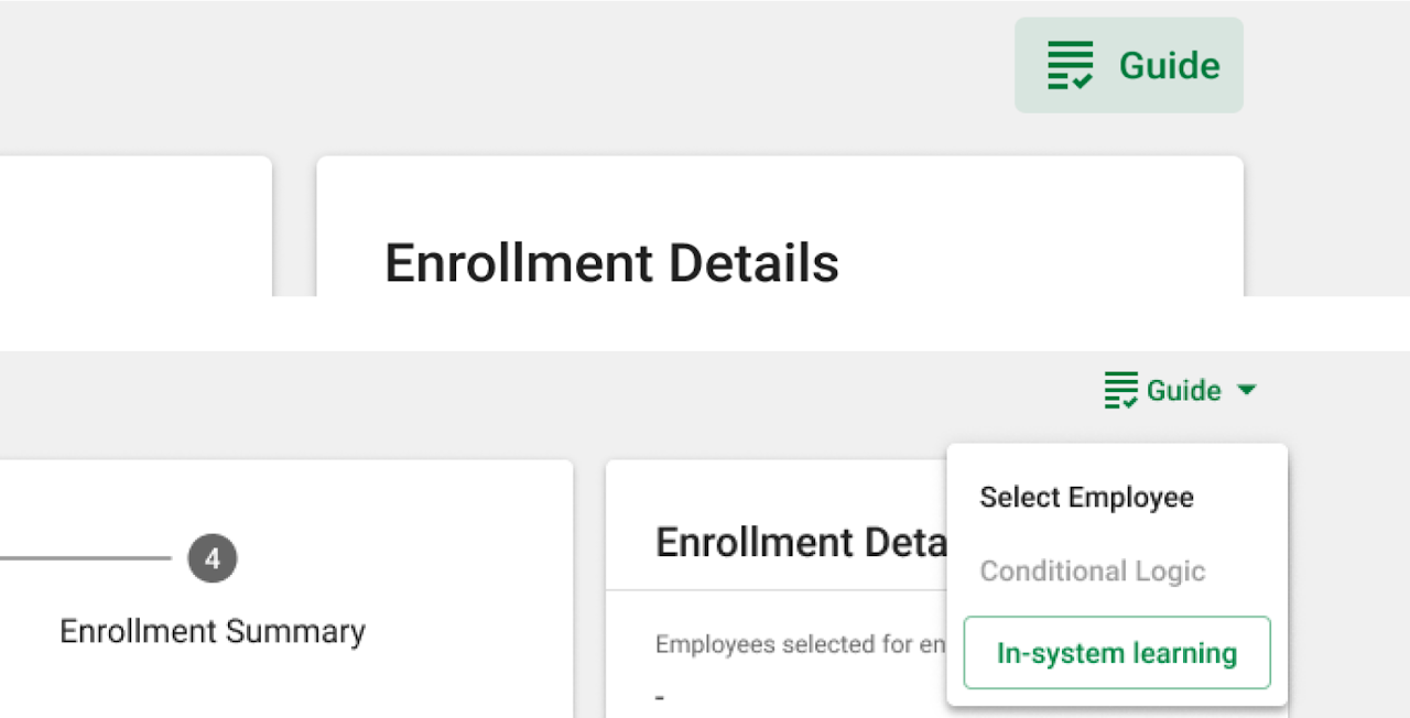
With this, our ISG toggle menu was finalized. In the end, we ended up deciding to have two different trigger designs that designers can choose between when setting up ISG for their product. They can implement a simple trigger that activates/deactivates the tool tips entirely with one click, or a trigger that has a dropdown menu with a few options for more complex products with many flows within a page.
Design solution
→ click to return to table of contents
After rounds of designing, testing, receiving feedback, and making revisions, we have come to our final designs and guidelines that prospective ISG usages must follow. This section covers this final system in detail.
ISG Definition
The In-System Guidance improves the user’s usage of Paycom products by providing “smart suggestions” and contextually relevant help to users when they need it, in a non-intrusive manner. It aims to increase user satisfaction, reduce support requests, and improve task performance.
Along with the general guidance, the ISG also provides an In-System Learning tool that allows the users to dig deeper into the product. It aims to answer some additional questions the users may have, and to assist in the user’s any prospective interactions with the Paycom products.
Final Tier Definitions
Tier 1 provides a high-level overview of a new product or feature. It provides a call to attention using one-time modals so the users are aware of the release, without any detailed explanation of the functionalities.
- Example products: minor releases on monthly spotlight
- Major component: modals
Use cases:
- When minor releases are made on a new product or feature.
- The information is worth being brought to the user’s attention at least once.
Tier 2 provides information assistance that provides the least system intervention and prioritizes the continuation of the user experience, utilizing tooltips.
- Example products: Custom ESS
- Major component: tooltips
Use cases:
- A new and minor feature is released within a pre-existing product.
- There are products or functionalities that often go unnoticed by the users.
- User analysis display patterns of confusion over specific parts of the product.
Tier 3 provides a walkthrough or a guidance that holds the user’s hand from start to finish of a new or complex product usage. It provides the most system intervention and halts the user’s experience to allow time for interactive information learning.
- Example products: Enrollment Hub
- Major component: tooltips and walkthroughs
Use cases:
- A sizable, complex product is newly being introduced.
- User analysis displays patterns of confusion over multiple functionalities of a product.
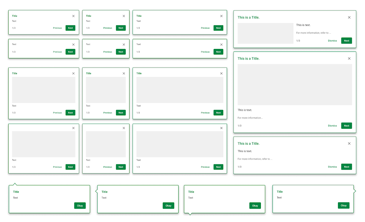
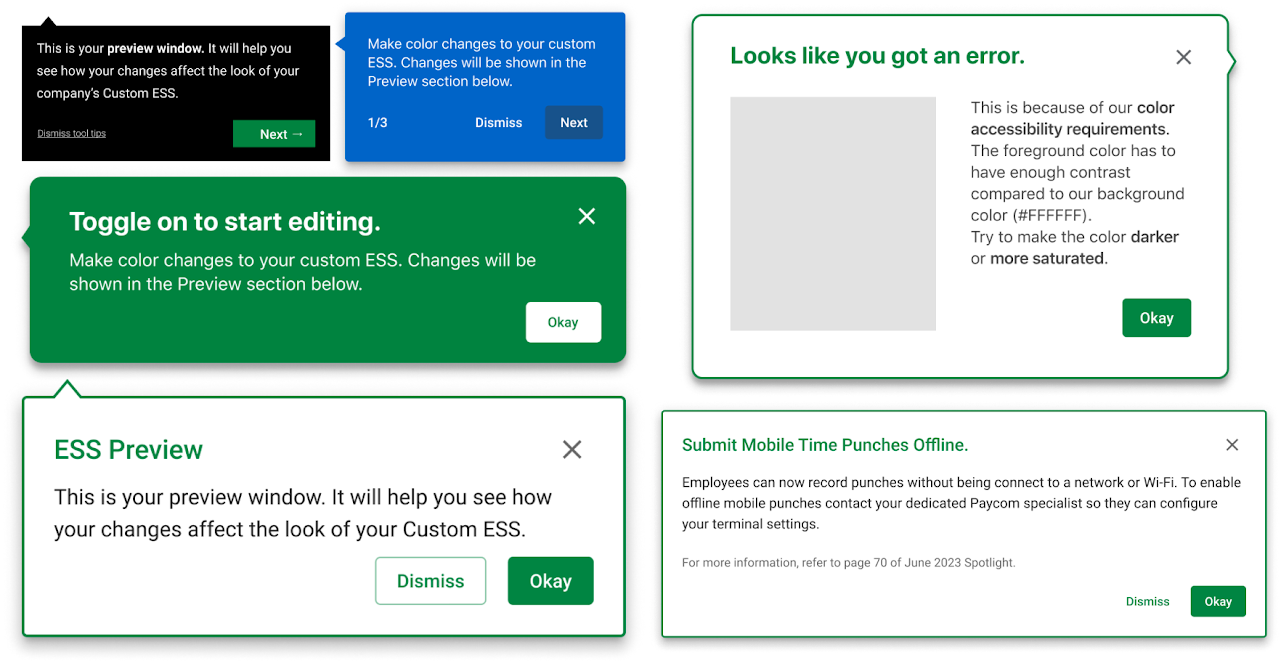
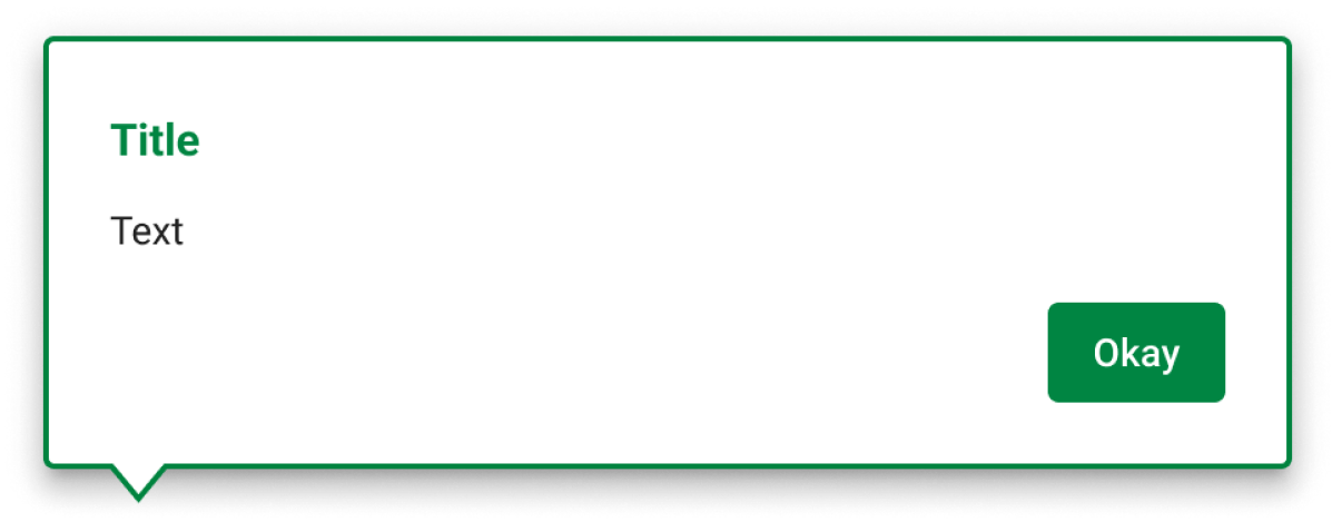
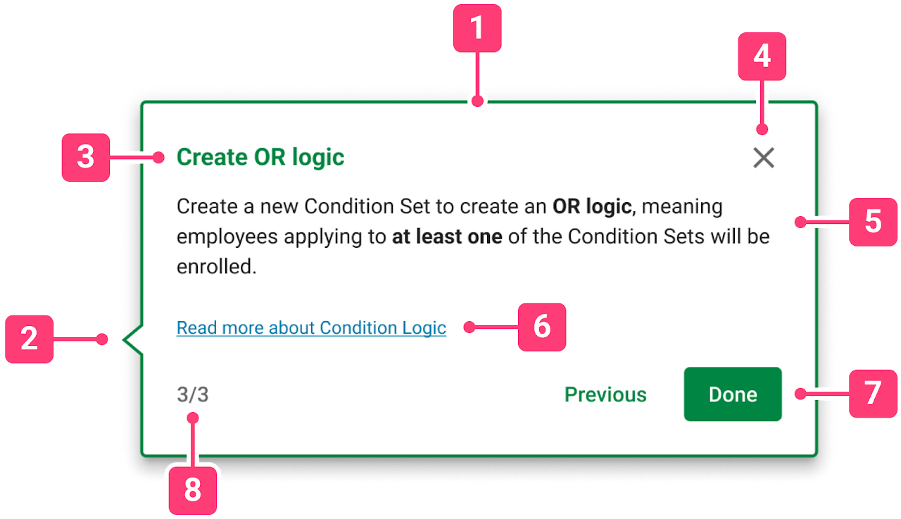
Component - Modal
The ISG modal will focus the user’s attention onto a specific information on a new feature or product and must be acted upon before attention can be shifted back to the primary workflow.
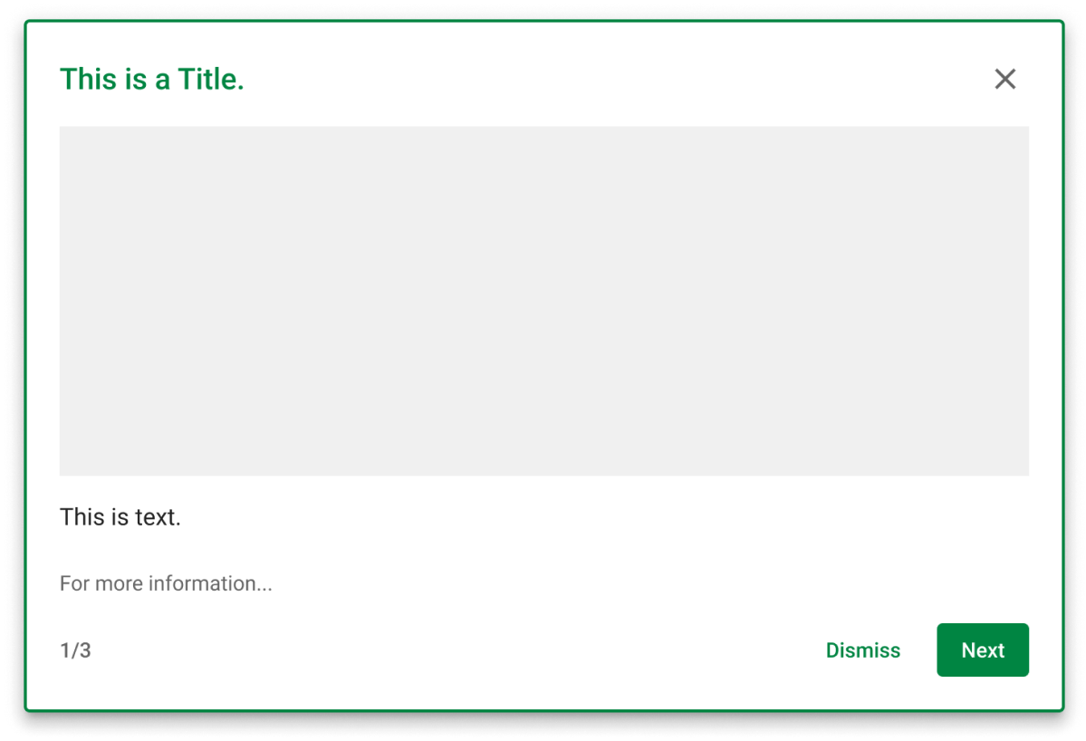
Size
The height should be set based on content. These are to have a width of 700px.
Position
The position should be set to center of the screen for general purposes. Do not use for cases where the product/feature is difficult to locate on screen. Instead, use tooltips to point to the product / feature.
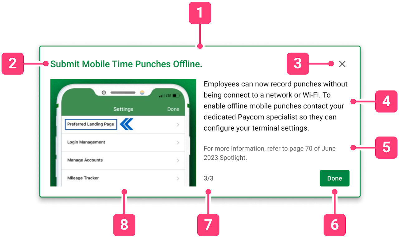
Anatomy
1. Container: this is the container of the modal, which has the focus of the screen until closed out of. Clicking outside of the container will close the modal.
2. Header: labels the modal. The header should be an attention grabbing and concise summary of the contents.
3. Close icon button: clicking this button will close out of the modal.
4. Content: this body of text will give a high-level overview of the new feature/product. Do not give detailed information on specific functionalities or use cases.
5. Secondary content: this will provide an internal hyperlink to Paycom product or directions for the users to access a more detailed information about the content of the product/feature. Text color should be “info” if it is a hyperlink, and “secondary text” otherwise.
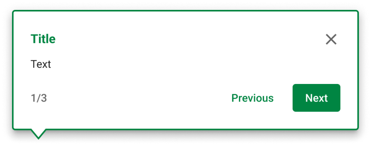
6. Action buttons: the primary button should be ‘Next’ or ‘Done’, depending on whether the modal has a multi-modal flow or not. If the modal is the last of the multi-modal flow, the primary button should also display ‘Done’. If the primary button is ‘Next’, the secondary button should provide the ‘Previous’ option.
7. Progress indicator: if the modal has a multi-modal flow, display the progress with numbers.
8. Graphics: use images, micro-videos, or GIFs for a visual representation of the content or for attention grabbing. If there are no visuals available, text-only modal is available as a variant.
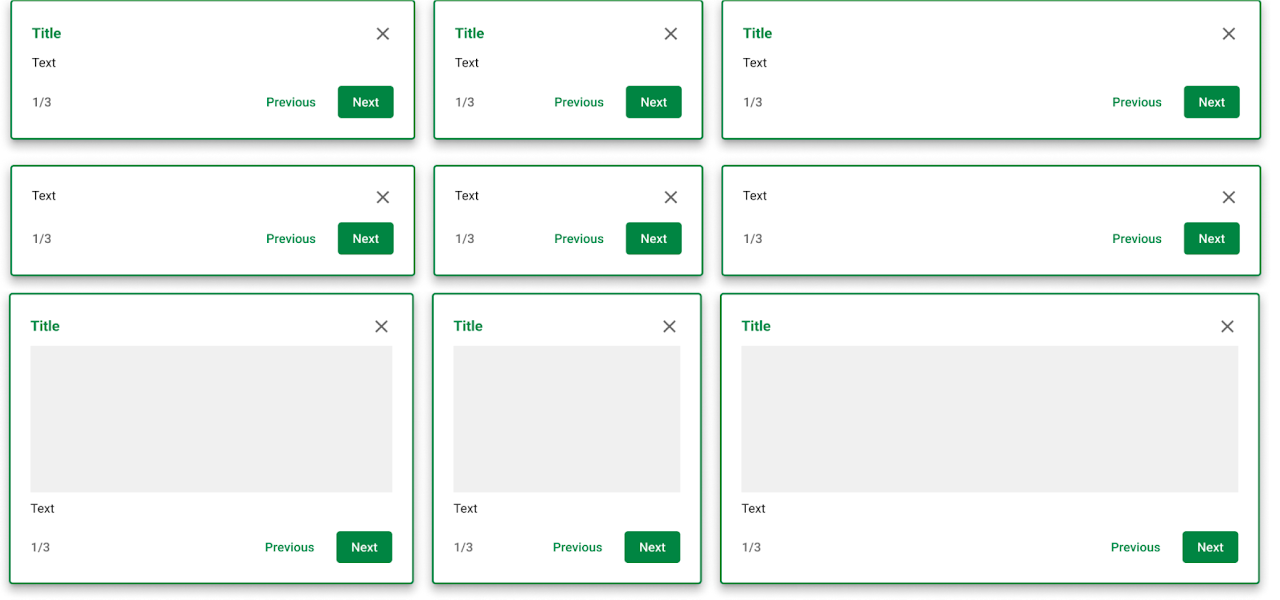
Component - Tool tip
The ISG tool tip displays informative text to provide clarity on a specific element of a product.
Nested component
The highest component has variants for tail positions. The nested component called ‘Content’ has variants for sizes, titles, and images.
Size
The height should be set based on content. These are to have a width of 300px, 450px, or 600px.
Position
The position should be set to directly above, below, or next to the specific element the tooltip is pointing to. Do not position the tooltip in a manner that would cover contents that it references to. If the scroll position is at the end of the page, the tooltip should be repositioned to either above or below so that the tooltip stays on the screen.
Anatomy
1. Container: this is the container of the tool tip. Clicking outside of the container shouldn’t close the tooltip, unless a scrim is involved.
2. Tail: this points to the element on the screen that the tooltip relates to. Align the tail with the element.
3. Header: labels the tool tip. The header should not exceed one line. Rather than summarizing the contents, aim to grab the user’s attention or to provide them motivation to learn.
4. Graphics: use images micro-videos, or GIFs for a visual representation of the content or for attention grabbing. If there are no visuals available, text-only tooltip is available as a variant.
5. Content: this body of text will provide detailed information about the relating element of the tooltip as concise as possible. Do not make extensive or wordy. Provide only the most crucial information to notify the user of.
6. Secondary content: this will provide a hyperlink to open the In-System Learning modal, if one exists for the product.
7. Action buttons: this primary button should provide means to dismiss the tooltip as sign of acknowledgement.
Component - Walkthrough
The ISG walkthrough is a multi-tooltip display that holds the user’s hand through their product usage in a detailed and interactive manner.
Nested component
The highest component has variants for tail positions. The nested component called ‘Content’ has variants for sizes, titles, and images.
Size
The height should be set based on content. These are to have a width of 300px, 450px, or 600px.
Position
The position should be set to directly above, below, or next to the specific element the tooltip is pointing to. Do not position the tooltip in a manner that would cover contents that it references to. If the scroll position is at the end of the page, the tooltip should be repositioned to either above or below so that the tooltip stays on the screen.
The series of tooltips connected into one flow in a walkthrough should generally be in the same area. The user shouldn’t have to scroll to find the next tooltip of the walkthrough.
Anatomy
1. Container: this is the container of the walkthrough. Clicking outside of the container shouldn’t close the walkthrough, unless a scrim is involved.
2. Tail: this points to the element on the screen that the tooltip relates to. Align the tail with the element.
3. Header: labels the walkthrough. The header should not exceed one line. Rather than summarizing the contents, aim to grab the user’s attention or to provide them motivation to learn. The header can be utilized even if the tooltip is not the first of a walkthrough flow.
4. Close icon button: clicking this button will close out of the walkthrough flow.
5. Content: this body of text will provide detailed information about the relating element of the tooltip as concise as possible. Do not make extensive or wordy. Provide only the most crucial information to notify the user of.
6. Secondary content: this will provide a hyperlink to open the In-System Learning modal, if one exists for the product.
7. Action buttons: the primary button should be ‘Next’ or ‘Done’, depending on which tooltip it is within the walkthrough. If the tooltip is the last of the flow, the primary button should also display ‘Done’. If the primary button is ‘Next’, the secondary button should provide the ‘Previous’ option.
8. Progress indicator: display the progress with numbers.
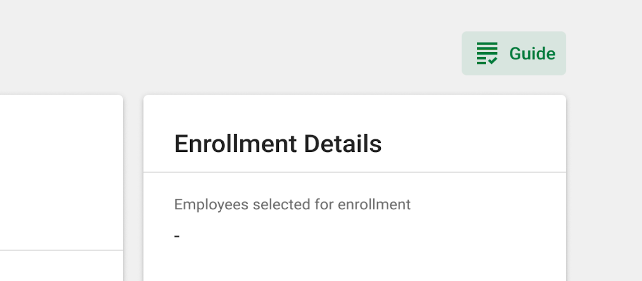
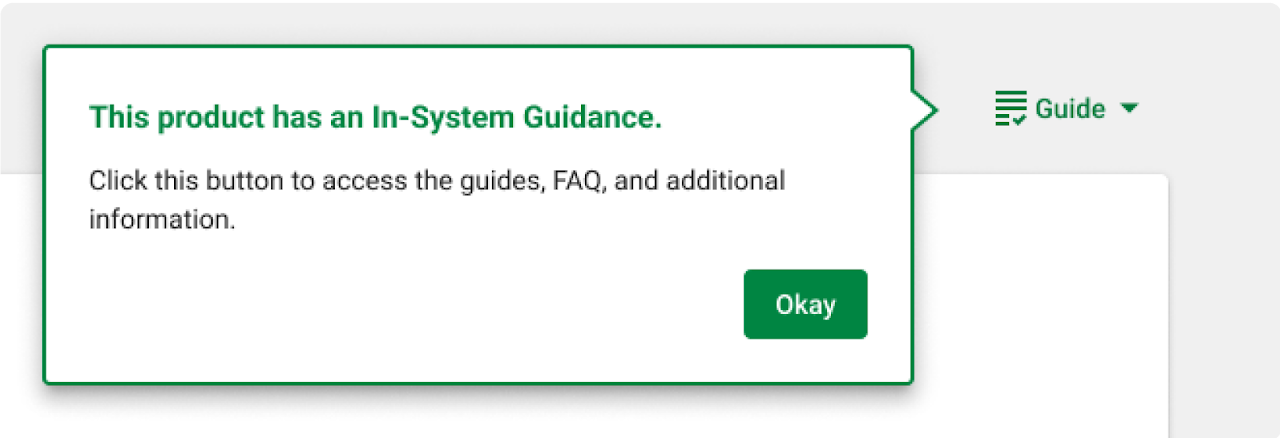
In-System Learning
In-System Learning (ISL) is a product-specific modal component of ISG that provides additional context and learning opportunities for the user looking for more detailed explanation on certain concepts or terms within the product.
ISL can be accessed in two ways:
- Clickable secondary content from the tooltips
- Dropdown toggle
Size
The size of this modal is fixed as 1200px x 800px.
Position
The position should be set to the center of the screen, just like the regular modals.
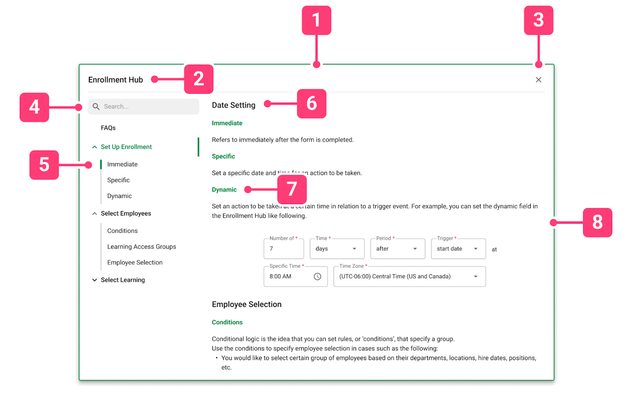
Anatomy
1. Container: this is the container of the ISL. Clicking outside of the container doesn’t close the ISL modal.
2. Header: labels the ISL with the name of the product that the ISL is available for.
3. Close icon button: clicking this button will close out of the ISL.
4. Search bar: this allows the users to search for specific terms within the ISL.
5. Navigational tree: this is used to navigate information that has been categorically divided into distinct groupings. The title menus are drop-downs, and they follow the organization of the product flow itself. The tree items that appear from the drop-downs are labels for the content. The navigation tree changes state along with the main content’s scroll.
6. Content title: this pertains to the high level menu that sections the ISL. It follows the organization and the titling of the product.
7. Content subtitle: this pertains to the secondary menu that labels the terms and concepts covered by the ISL. When the top section of scrolling hits each of these content subtitles, the navigation tree changes state and follows the content subtitle that shows on screen.
8. Content: the content of ISL includes definitions of terminologies, detailed description of concepts used by the product, or examples of product usage.
FAQs
The first menu in the navigational tree will always be FAQs if the user pain points of the product usage is known. This section should cover all questions that the users may be asking. These questions can be discovered through research and/or testing phase of product design. The purpose of the FAQ section is specifically to lower the customer service requests our service representatives receive.
Content
When filling the content of the ISL, do not re-direct the users to external websites. If internal links are provided, they should open up new tabs so that the user can continue their workflow in their original tab.
The best practice is to give contextual definitions and examples of terms and concepts in Paycom standards. Provide visual examples such as screenshots or simple diagrams.
Scrim
A scrim is sometimes used in the ISG experiences to focus the user’s attention on the system presented learning. The scrim is a 40% opacity black rectangle, placed between the overlaying ISG layer and the product itself.
When using a scrim with a tooltip or a walkthrough, exclude the element correlating to the tooltip from the scrim.
Use cases:
- Modals
- Tooltips or certain steps of walkthroughs that are more crucial than the other parts, but are being overlooked by the users
- Tooltips or certain steps of walkthroughs that point to elements of the page that is difficult to notice
Toggle
ISG toggles change the state of the ISG on or off, and offers users a chance to revisit the ISG when they need a refresher.
Tier 1 doesn’t use a toggle, since the Tier 1 information intends to be a one-time notice for the users. Tier 2 and 3 have options to use the basic or the dropdown toggle, based on the number of flows and the availability of In-System Learning.

Basic toggle
The basic toggle is a button that can be pressed to turn on or off the ISGs available within the specific page of the product. Use the basic toggle for Tier 2 ISGs, or for Tier 3 ISGs that have one flow within a page.
Dropdown toggle
The dropdown toggle allows the user to chose which ISG flow to enable within the page. Use the dropdown toggle for Tier 3 ISGs that have more than one flow within a page.
The flows within the dropdown should be ordered in a chronological manner that follows the user flow of the product. If an ISG flow is only available upon a certain trigger action (for example, if section A has to be completed before accessing a flow in section B), then display the flow as a disabled button.
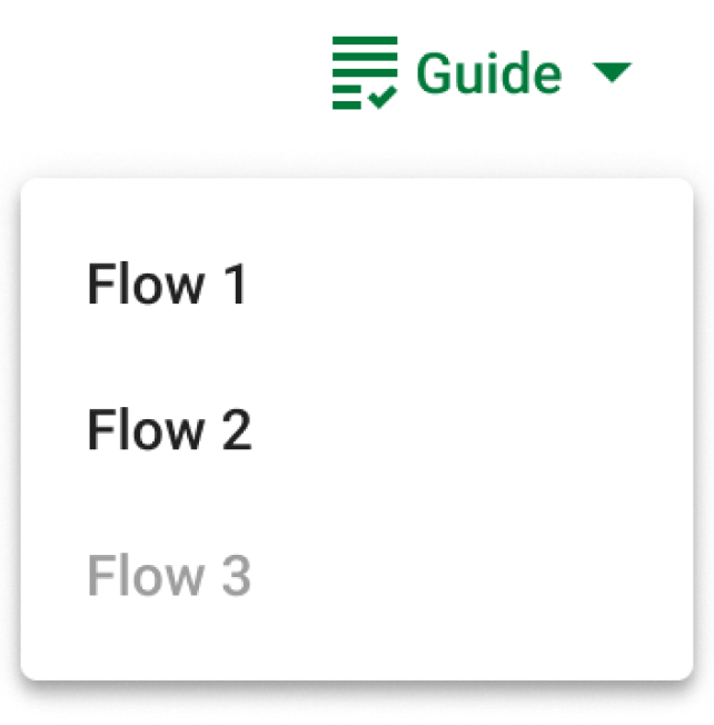
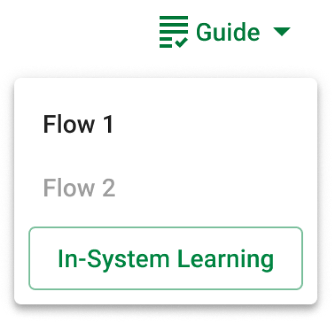
Dropdown toggle with ISL
The dropdown toggle with In-System Learning should be used when a Tier 2 or 3 product includes an ISL modal, even if there is only one flow within a page. Clicking on the In-System Learning button triggers the In-System Learning modal to display at the center of the screen with a scrim.
Initial pointer
In order to point out the availability of ISG to the users, all products with the ISG available should have an initial pointer to the ISG toggle using the ISG tooltip component. This pointer appears only once when the user interacts with the product for the first time.
Verbiage
ISG is secondary in nature, not a primary guiding text. Therefore, we must be mindful of how to word the ISG text to create an encouraging and non-disruptive flow. Based on our research on the learning theory and andragogy, following best practice standards are to be followed:
Keep it short
Keep the ISGs to a few sentences. If there is more to be communicated, use multi-modal flows or walkthroughs and break up the flow into several steps. Any in-depth explanations that may seem like too much information should have secondary content that links to ISL or other internal resources.
Use consistent formatting
Some ISG have titles and images, some don’t. Be mindful of these usages throughout a product to keep the overall flow not too overloaded or inconsistent.
Write in active voice.
Avoid passive language and use active, engaging language. Use words that are action-oriented, often starting with a verb. This is preferred for any UX text, and especially for tooltips since they need to be brief and empowering.
Use simple language.
Keep the vocabulary simple, to elementary school level. Limit jargon, acronyms, or technical words. Use AP style language in general. However, when technical words are needed, keep the language aligned to the product line or the Paycom brand itself so that the users speak our language.
Motivate users.
Consider how to grab user’s attention when writing the headers. Then, if the users are successfully following along, use rewarding language and/or visuals.
Include the benefit of utilizing ISG learning. Apply the “What > So What > Now What” approach. This is where you first explain what the feature is (the What), then the benefit (the So What), and optionally a call to action (the Now What).
Don’t let the users get discouraged.
Do not impose or shame the users with words when they fail in some task. Use words like “we” and “our” to make the user’s problem our problem. Empathetic phrases create reliability.
Accessibility considerations
Accessibility for ISG should be closely communicated to the development team in order to make an inclusive experience. Based on our research on the product accessibility, following best practice standards are to be followed.
WCAG 1.1 - Alt Text
All visual aid, including images, micro-videos, and GIFs within the ISG, must have descriptive alt text.
WCAG 1.3 - Tabs
The ISG is always at the forefront of the hierarchy of the screen. For all modals or tooltips with scrim, the ISG should be the first in the navigation order. Other contextual tooltips should have a tab order that follows directly after the on-page element that it points to.
WCAG 1.4 - Distinguishable Elements
Include captions for videos if possible. Give multiple ways of accessing the content within ISG.
WCAG 1.4 & WCAG 2.0 - Links
Color alone is not used to distinguish links from surrounding text. Underline all secondary content that direct the users to ISL or internal links.
Handoff
→ click to return to table of contents
As I mentioned at the start in the disclaimer, we wrote a 65-page documentation regarding everything and how to use the things we made. It serves as an important part of our handoff process, as it covers the majority of the design process of the ISG, from problem identification to solution iteration and testing. A more detailed information is accessible to Paycom employees in our Figma file - including all the interview recordings, deliberations on design decisions, rough notes, and so much more.
As of right now, the product department at Paycom is in the process of deploying this intern project into their products, with the help of our documentation. We did everything we could to make sure that we wrote and documented every aspect of the project, and organized it in a way that'd minimize the potential for future designers to re-do work that's already been done.
Reflection
→ click to return to table of contents
During the internship, we were able to conduct various forms of research, create and iterate on multiple designs and prototypes, conceptualize a product, and prepare an MVP ready for hand off. When we first saw the list of deliverables and the tight timeline, there was a slight sense of uncertainty about completing everything that was expected. There were also times when we needed to redefine and re-comprehend the global concept of our project.
Looking back on the work we did, I am very proud to say that we far exceeded our own expectations, and even expanded the scope of our project beyond the original goals.
As we paved way through our goals, we’ve faced multiple situations when our ambitions were too great for our time constraints. One such case was prototyping - we initially planned to have four detailed tasks for the Enrollment Hub usability testing in order to evaluate the usage of every aspect of our product. However, a narrowing down of the scope was necessary as it was slowing down our timeline. Multiple conversations and re-adjustments during the project has taught us the proper sense of the work timeline, and how to manage time and to set realistic goals.
I learned a great deal about the product development lifecycle, meeting real world deadlines, expectation management, collaboration, and more. I learned that in order for people to innovate, they should try their best not to get attached to ideas. In a fast paced and creative environment, everything is subject to change.
Be open and don’t be afraid to ask questions! Every conversation ended in a fellow product employee extending a helping hand in some way. The product department felt very neighborly and giving, which inspired me to ask more questions, have more meetings and reviews, and pay it forward as much as I could during my duration here.
Most importantly, I learned the importance of keeping open and honest communication. I benefitted a great deal from being realistic about how much work I would be able to get done on any given day, and respecting the needs and styles of working of my various collaborators. With thorough communication, we were able to thrive off of each other’s strengths and compliment each other’s weaknesses.
thank you very much for reading/browsing!