♻️ recycl - retail recycling assistant

Context
In August 2021, I signed up to participate in a 7-day long design jam hosted by Adobe in collaboration with Target. This was a design jam exclusively for students, and you had to be in a team of at least 2 to participate. The brief, outlined later, was given to us at the start of the challenge.
The finished product
We created a prototype for an iOS app that allows retail stores such as Target, QFC, Safeway, etc. to host a rewards system & friendly competition program that encourages people to utilize their in-store recycling facilities. This would positively contribute to their carbon footprint and help local communities foster a spirit of "do-goodism."
Software used:
Adobe XD, FigJam, Adobe Illustrator, Word, Zoom

Brief
Your challenge is to design an inclusive third-party mobile app to facilitate retailers help their local communities educate, encourage, measure, and/or track recycling.
Create a mobile app. Your team may design either for iOS or Android, and select the appropriate template when opening a new file in Adobe XD.
App must include 15 or more unique screens connected together. This encourages you to build out more of the app’s functionality to capture a more realistic user flow.
The app must be created during the event time period (7 days) and not be derived from previously created work.
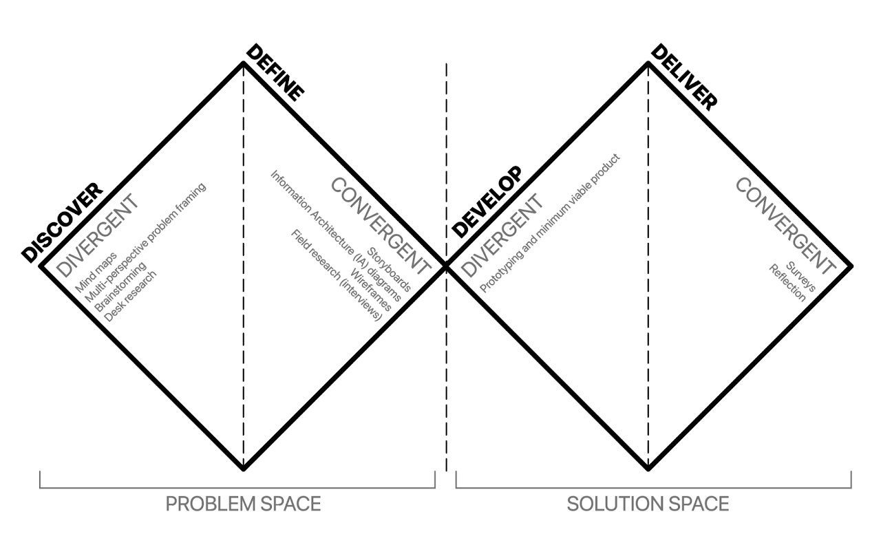
Since I had limited time, I leaned on the Double Diamond framework to help me prioritize my work. I would use the first half of the allotted time to research and devise a plan, and the second half to create and iterate.
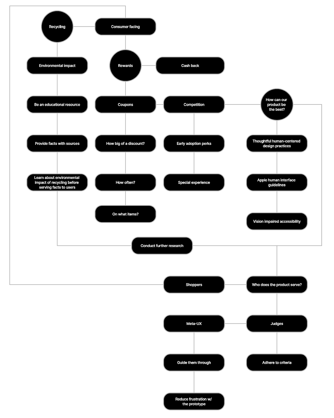
Mind mapping & brainstorming
Here I was trying to translate a stream of consciousness into ideas. I kept bouncing off of how things related to one another, keeping in mind the scope of the project, target audience, and the potential future product vision:
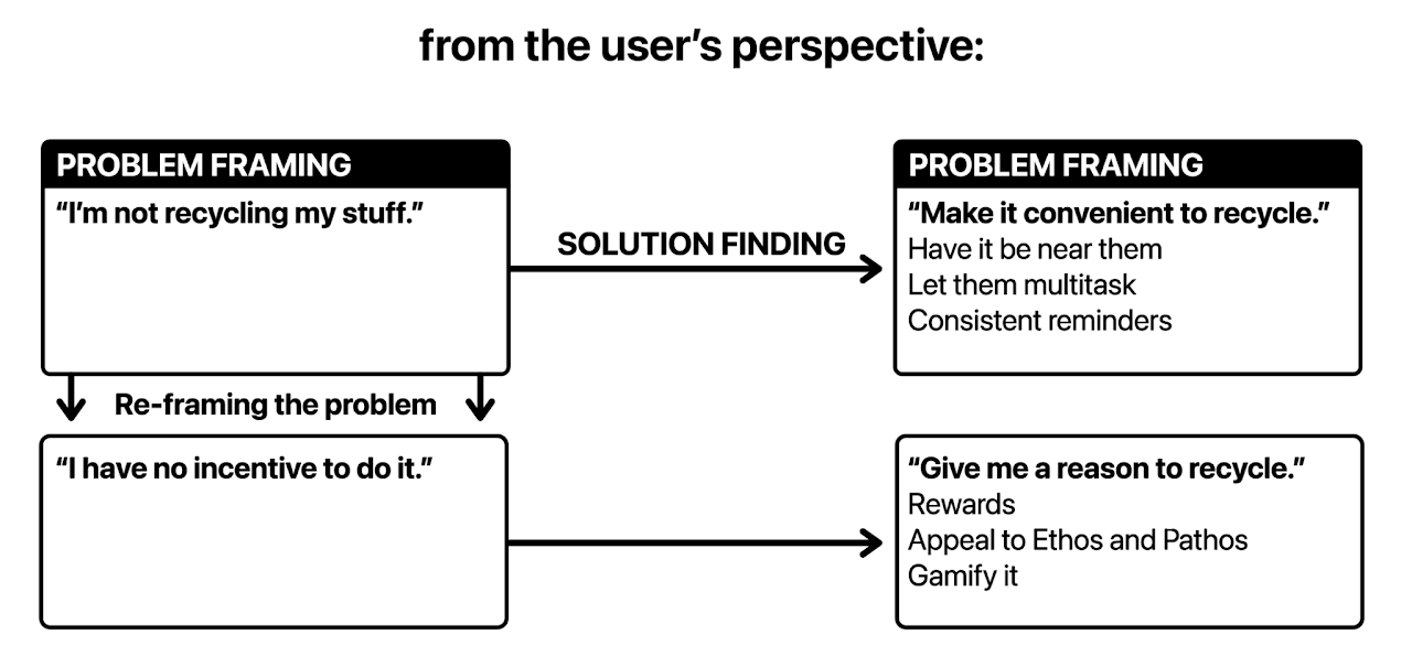
Problem framing
Based on preliminary research, I tried re-framing problem statements that both users and stakeholders might have as opportunities.
Further brainstorming & research
From the beginning of the project, the assignment clearly stated that the solution to an unknown problem was getting consumers to recycle at stores. This meant that I didn’t need to spend time focusing on whether or not recycling was the right idea in the first place, I could just get to work on creating the best version of this solution that I could come up with.
Since the project was team-based, I could get my teammate who was a stranger to visual and product design to help me with the research portion behind the incentives and education features of the app. Here are some of my teammate’s most important takeaways from that research:
- Recyclable materials that are thrown away end up in landfills, harming wildlife and ecosystems.
- Plastic takes 450 years to decompose, while glass takes over 1 million years.
- Much of the plastic ends up in the ocean and consumed by the fish that end up in grocery stores.
- By 2015, only 9% of the world’s plastic has been recycled, and 79% of it is somewhere out there on our planet.
- Recycled materials are used to make bottles, clothes, bags, shoes, and more.
Something else we found in our research, as shown in the problem framing and mind map, is that people are reluctant to recycle because it’s simply inconvenient for them. As a result, we figured that giving them rewards for doing so would be a good place to start. We had other ideas such as a raffle system and apple wallet integration, but they ended up being scrapped due to unfairness in low population areas and time constraints respectively. This project was particularly challenging because of the 7-day time constraint. As anyone who has done a hackathon or a game/design jam would know, it’s quite difficult to condense the entire design process down to a short time window.
We decided that the user should earn $5 for every 15lb of recycling they produce. 1lb of recycled cans is worth ~$0.59. This means that to earn $5, you'd need to drop off around 8.5lb (or $8.85) worth of recycled cans. We figured that $5 for 15lb is a good figure, since this hypothetical app would need to cover the cost of its own upkeep somehow. The app also makes it a lot easier and faster to recycle your goods when compared to a nameless facility that may give you more money for your recycled goods.
Something we overlooked was how to quantify the value of recyclable products that aren’t just cans or paper, since the rewards system is based on the weight of the goods you drop off.
Storyboarding
Following the research and brainstorming sessions, storyboarding began. I came up with a flow that made sense and allowed the user to complete the tasks deemed necessary for this challenge in as few screens as possible. Since the challenge required 15 unique screens though, we would have to add a couple other screens to hit that goal.
Since the app was being judged, I felt like we needed a layer of meta-UX for the judges.
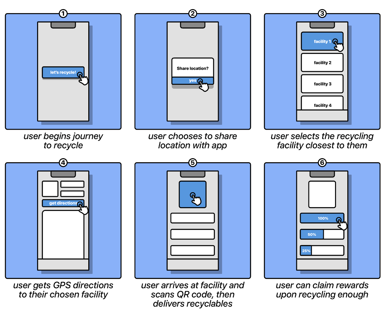
I came up with the idea of having a "navigator buddy" like Microsoft's Clippy. This way, the judges of the contest would know exactly where and when and where to click. In a real app, you would be able to click anywhere, but prototypes are quite limited in terms of functionality. Ideally the app would be intuitive, but we wanted to make sure that onboarding was easy and didn’t put too much cognitive load on the user from the jump.
The goal of the storyboard was to aid with solidifying the functionality and mission of the app, as well as giving guidance for the next stage of design.
Information Architecture
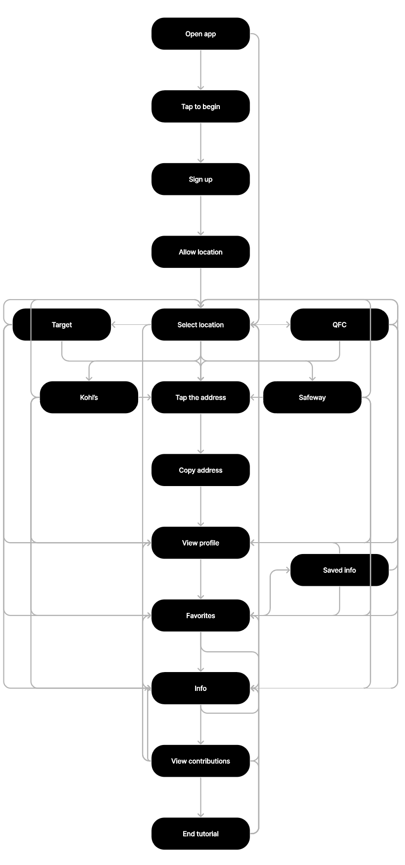
With the aid of the storyboard, work began on the high-level information architecture part of the project. In order to move on to the next stage of wireframing, the user flow needed to be determined. Here’s what that looked like as a stream of consciousness:
Splash screen > greeting > ask for location > recycling locations > location details (accepted items, address) with “copy address to clipboard” for GPS usage > buffer screen> explain how to use facility > qr code > community/personal contributions > information and resources > rewards > end
Greeting: Let's help you collect rewards while you help save our planet! "Sign me up!" > Ask for location (prompt) > Location details: Here’s a little info about this facility. Hit the blue button when you’re ready. > Buffer screen: Great! The address of the facility is copied to your clipboard, ready to put in your GPS. > Explain how to use facility: When you’re ready to head to your local facility, you will need to follow these 3 simple steps: Go to a kiosk and scan your personal recycl QR code, Deliver your recyclable goods Reap the benefits (WE HAVE REWARDS) > **BIG GIANT BUTTON THAT SAYS “Get my QR code”** > Qr code: just a qr code (also maybe a button that says “Add to wallet” or something to integrate it into apple wallet? If time allows) > Information and resources: Now that you’re ready to go, here are some facts about how you’re helping the environment. (bulletpoint facts) > Community/personal contributions: placeholder statistics about lbs of recycling turned in within a 50 mile radius of you > Rewards: This is the rewards page. Here, you’re able to see a preview of the different rewards tiers, and your progress towards unlocking each of them. > End: Welcome to recycl!
Wireframes
The app is finally beginning to take shape! Building on the previous steps, I came up with some rough wireframes to help me with the production and layout of the final prototype.
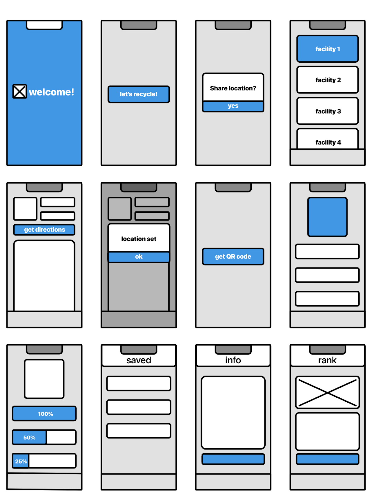
I thought an effective and time efficient way to fill out the 15 screen requirement would be to have details of different facilities; this way I could use the same screen layouts while displaying unique information to the user.
This, however, was pretty boring, so I also added a rank system to further incentivize people to recycle. Now people could see how they stack up in terms of how much they recycle compared to locals.
I also implemented a "favorites" or "saved" feature, in case the user is particularly fond of a facility or they don't want to search for one they’ve already been to.
Field research - interviews
Seeing as the design jam only ran for a week, scope creep was something that my teammate and I needed to be extremely cautious about. We couldn’t conduct large scale interviews, ideation sessions, focus groups, etc. in the time that we had, but we did ask a group of 10 people some short questions after they were briefed on the purpose/goal of the app:
- Do you feel content with the amount of recycling you do?
- Have you used a grocery store app before? If so, what is something you liked and disliked about the ones that you’ve used? If not, why not?
- On a scale from 1-10, 1 being the least likely and 10 being the most likely, how likely are you to use an app that rewards you for recycling?
- What expectations do you have for this app?
We did our best to keep the questions open-ended to avoid introducing bias into the answers our interviewees gave. We got a variety of answers from the people we surveyed, and we learned that people, although they don’t know this is why, seem to notice when an app is coded in react versus being native for iOS or Android because of how different and “off-putting” it looks. Some of the things we learned to watch out for were the aforementioned Apple human interface guidelines since we’re designing for iOS and making sure that users don’t get trapped in island tasks. We also learned that our group of interviewees were more likely to give an app a break/cut it some slack for bad user experience as long as they get something of monetary value out of it.
Visual design
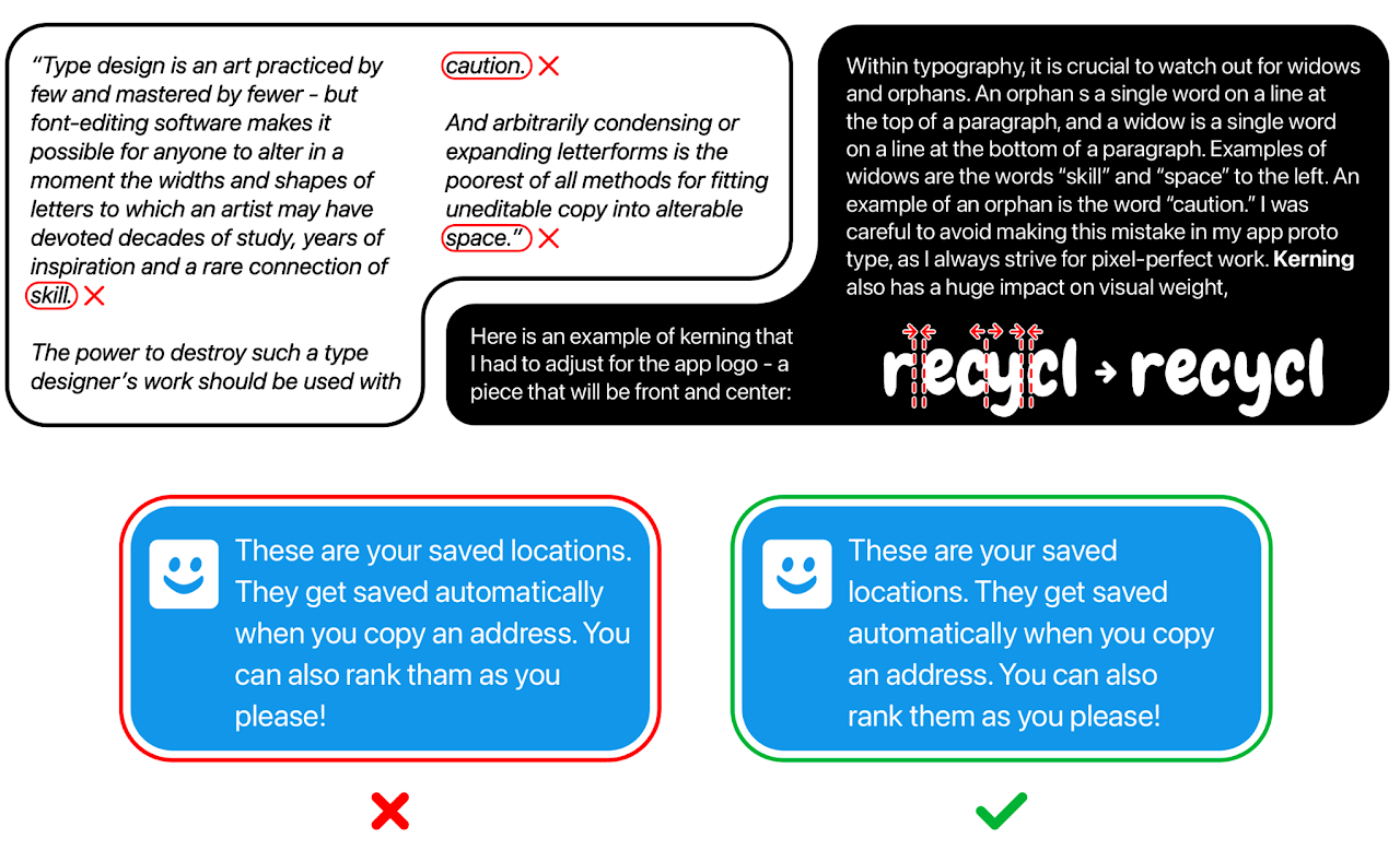
I made sure to pay close attention to the branding and visual design of the app itself. I tried to avoid large differences in rag on text blocks, have good color contrast, kern and carefully modify repeating elements, and follow the Apple Human Interface Guidelines.
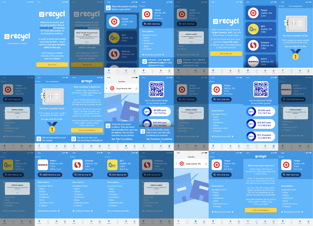
Prototype
With all the leg work behind us, we finally had a prototype of the minimum viable product. Sure, it is limited in features and some real-world problems weren’t fully addressed, but we had something to show for our hard work at the end of a week of researching and designing. Hooray!
Surveys & reflection
Having a finished prototype at the end of a busy week of hard work was extremely rewarding. However, in the real world, the work doesn’t stop there. Before submitting the project and receiving our scores from the judges (which ended up being 27th place out of 290 participating teams) we went back to our interviewees with the prototype to get some final opinions.
The interviewees all said that our app avoids the things they dislike about other grocery store apps, but some found the tutorial sequence annoying because they couldn’t skip it.
I learned that the majority of the people I interviewed wouldn’t have agreed to it if they didn’t know me - stating that if a company asked them to be interviewed, they’d have to get some sort of financial compensation to agree.
The judges knocked off points for creativity and intuitive-ness (or lack thereof). They stated that the way we attacked the problem with a rewards system is a bit uninspired and already exists, and that the app isn’t intuitive because we felt the need to have a personal assistant guiding them through every step of the onboarding process.
Upon further reflection, I agree with the assessments of the judges. I also think that the finished project should have followed Target’s branding and design style, seeing as they were the ones that facilitated the design jam. We ended up with a more generic product that could be applied to any retailer, but that just means we’ll put more of a focus on details like this next time.
Overall, our product had some failures and some great successes. Completing the conception, research, design, and prototyping of an entire app in 7 days was a tough but fun challenge, and it helped my teammate and I gain a better understanding of details that can make or break someone’s first impression of a product.
Try out the prototype:
thank you very much for reading/browsing!